Thursday, May 31, 2007

SALT IN THE DUNGEON OF DOOM!!!

saltdungeon
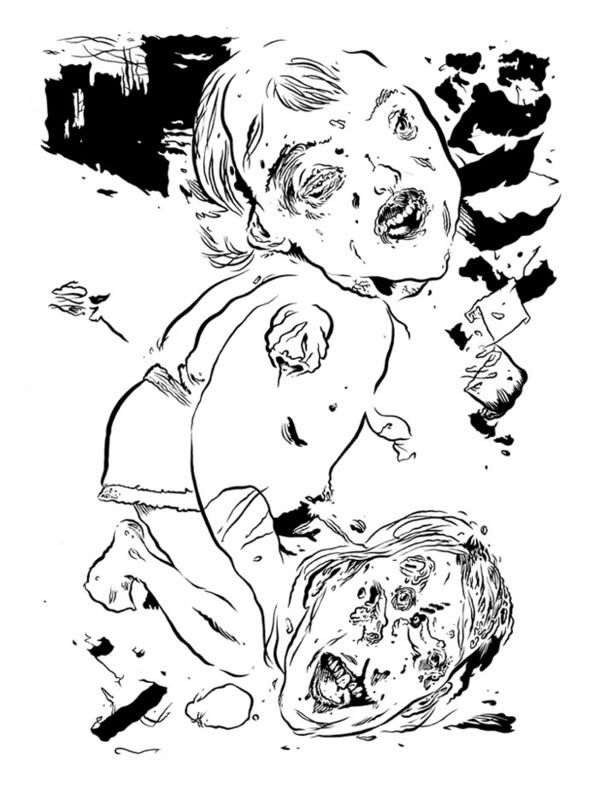
Page for upcoming entry in the second issue of ELFWORLD. It's a redraw of an older piece. Mad respect to anyone who can figure out where i lifted the general structuring & concept of the piece from. No guesses, just informed answers pleez.
www.family-style.com/elfworld.html
Salt & the Dungeon of Doom or some such. Egg-citing!
Also, i thought i'd add that if any of you were worried about how raising a kid would cut into your creative work, i'd just like to inform you that i'm knocking out just as much stuff as before & i'm not neglecting Otto either. You can do it! Family & art can co-exist!

Wednesday, May 30, 2007

Tuesday, May 29, 2007

Watch THIS blog action thrill!


Boing...

Maybe for Entartete Kunts!?!

SALT the youthful adventurer
salt
A Chaos Warrior of some sort. As i was working on this one i realized that i am mixing Jack Kirby & Ed Roth at the same time. Whee!
choaswarrior
A Dragon Newt on some kind of similarly evolved riding beast. Love the bipedal riding beasts!
dragonnewt
Punk Snot Dead: Wattie Piper, some punk dude.
punksnotdead

These might end up in the Entartete Kunts show that i'm involved in.
http://dennisdread.blogspot.com/2007/02/blog-post.html
Anyone in Portland & the surrounding areas should definitely check this show out.

Monday, May 28, 2007

NO MIRRORS FOR ME by BASIL WOLVERTON

Everyone here should know who Basil Wolverton is, if you don't, look him up. He's the master of the "spaghetti & meatballs" grossout drawing style. Here's a piece he wrote that's worth passing on.

No Mirrors For Me by Basil Wolverton

Including the gallstone change, I gave up planes, boats and theaters a long time ago. It was too much to continue watching those dread-drenched faces every time I appeared in public. It was futile to try to explain to anybody that so many years of cartooning had caused my head to vaguely resemble a huge, human drawing pen. Only my creditors refused to avoid me, and of course they always shall. Occasionally some of them ask what turned me into a monster artist. Naturally they refer to an artist who draws monsters as well as a monster who supposedly is artistic. That was another frenzied phase of existence that started years ago with a violent cirrhosis attack brought on by watching a horror movie titled "The Laughing Liver Larva." After hastily consuming a box of liver pills, including the more edible box, I eventually felt better.
But that wasn't the end of the matter. A few days later there was a telephone call from the editor of the comic books in which my features were published. Being the typical comic book editor, he was less difficult to listen to than to look at. Or perhaps it was the reverse. Or both.
"Why are all your cartoon characters turning out liver-shaped?" he demanded in his usual dose of decibels. "Your stuff looks as though it has been drawn in a cat food factory! Get it back to your usual stuffy style or your salary will get cut in half!"
This was a horrible shock. It meant possibly going back to four dollars a week. That would mean a total of only six dollars a week, including my unsocial insecurity.
My editor had grounds for his beef. Ground beef, one might say. It had been a mistake to draw my cartoons carelessly with my eyes glued to a television screen. There was no awareness of an uncanny urge, produced by the liver pills, to bat out everything in the distorted, liver-like shapes. Unkindly critics might even go so far as to say that I didn't know what I was doing. Even the kindly ones might say the same. It was far from obvious, even to my psychiatrist, that this was only the beginning of my drawings starting to resemble myself, my editor, my wife, my butcher, and even my brother in law.
The real trouble started when my brother-in-law and his family moved in with us. There has never been such a ghastly gang of goops. My brother-in-law, a naturally armless juggler who ridiculously manages to accomplish everything with his feet, including cleaning his fingernails, married the original ghoul girl. Without even planning they managed to come up (down is a better word) with seven unsightly savages.
My morale and blood sugar were already low from the liver incident. At the same time my blood pressure and purple corpuscle count were staggeringly high. It was almost impossible to work while this gruesome gob of guys engendered by my mother-in-law was crawling on the ceiling. Besides, they diverted my attention when it was time for Sesame Street. It was too late to tell my brother to leave. He had already borrowed my contact lenses, which he used in his ears at shower time to keep out water. If he should leave in a state of irritation, so would my contact lenses. Furthermore, there was the matter of my brother-in-law's wife. She had to stay plugged into one of our electrical outlets to keep her tired blood circulating. If her husband left, she would have to stay behind, and she was more grotesque than he was.
All this pressure exerted by the quaint characters hanging around was clearly affecting the quality of my cartoons. Happily, there could be only improvement. It was no surprise, therefore, when another coast-to-coast collect telephone call came from my editor.
"Congratulations on doing away with that liver look in your cartoons!" he bellowed, and hung up.
Leering with satisfaction, I stood rooted to the spot, having stepped in wide wad of my brother-in-law's discarded gum. The phone rang again. It was my editor with another collect phone call.
"I forgot to mention that you're fired!" he yelled. "Your cartoons may be less livery, but now they're somehow more morbid! And don't crowd your curiosity wondering about your replacement! We're hiring Henry Kissinger!"
Yes, my brother-in-law and his family are still with us, and inspiring me constantly as a monster cartoonist. Today only the very choice publications use my kind of work. They include The Abominable Snowman News, The Transylvania Transcript, The Martian Morning Menace, and of course, The Monster Times.

Mengeloid!

Some of you may already seen this one, but what the hell.

MENGELOID!

Sunday, May 27, 2007

This is where we put the politically correct people. Ha ha.

cavebeast

Saturday, May 26, 2007

A Colorful Blob


the result of messing around with some watercolors today.

Thursday, May 24, 2007

From the next installment of SALT! This is Salt's gang "THE BLACK BATS" on the opening page.
saltreturns
The first installment of SALT! was in Papercutter #1 published by the swell chap Greg @ Tugboat Press.

Molluskhead Page

I'm preparing an older MH story for publication in an anthology right now. Initially I wanted to make it longer but I ran out of time when I first did it, so for this occasion I finally did the missing page.

Sunday, May 20, 2007

The beasts come out at night


Another couple hundreds sketches of odd beasts and characters. I keep drawing the lightning bolt symbol into a lot of these, not sure why. I might have to turn those characters into a storm or electrical cult. With the originals being incredibly light pencil lines these digitally darkened versions help a lot in figuring out how to handle the blacks when working back into them.

Saturday, May 19, 2007

MORE & MORE? & MORE

Here are the Kobold & the Beholder in color...
kobold

beholder

& my new personal favorite, "VOMITROCIOUS". I've got a five year old girl in one of my drawing classes that always says, "VOMITROCIOUS."
vomitrocious

Cycloptic Arnold


I was watching Predator a few nights ago and the video file started glitching out because I had ten million applications running as usual. But it froze up on this really hillarious and bizarre scene of Arnold looking like a cyclops.

Friday, May 18, 2007

DUNGEONS & DRAGONS

A Kobold
kobold
A Beholder
beholder

There will be color versions of these, but i had to scan them in black & white for my friend Clint Marsh's old school role playing game newsletter "THE SHRIEKER".

I also just finished a monster made out of Cheetos & am working on a monster made out of vomit. Connection? Nope.

Thursday, May 17, 2007

THIS GUY AGAIN!?!?

Even More Monsters


Been going crazy with these lately, here's another 100 sketches. Hoping to get the complete 1,000 finished soon. Started doing these weird Aztec rock monster things here that I might do a few more of.

Mostly words, but a doodle too.

I'm trying to find a way to break out of the rut I'm in. All the stuff I'm drawing is feeling very samey, and I want to constantly improve and expand, so a departure of sorts was in order. I'm mucking about with the dry media tools in painter, and I think I found a bleed/resaturation setting that gives you an OpenCanvas like ability to blend color, but still a grainy finish, which I really dig.

I'm using the flattened pencil tool at it's default settings for the linework (which is really placeholder and throwaway - I intend to substitute for my inked lines eventually) and Sharp Chalk with a 50% Resaturation and a 80% Bleed.

My inks tend to have a strongly defined light source, so I think a method that works well for me is to throw down large swaths of color behind the pencils/inks in a seperate layer. I highlight certain areas that make sense within the context of the lineweights I've already created and then start to render from there.

I've never worked this way before. I always opted to paint in greyscale on a solid, 50% grey background. I've only done one test so far, and it took all of about ten minutes, but I'm liking the potential here for print/editorial work. I think my solid, spot hues work great for limited color pieces like tee designs, but for situations were more elaboration is allowed, I think something like the following test is worth pursuing:


Having a broadly defined light source sitting in the underpainting allows me to solve all my highlighting and shadow issues pretty intuitively. I'm really glad I decided to fire up Painter and doodle a bit.

My site is about to relaunch. When it does, I intend to post a video/sketch diary of sorts. Lots of videos of the working process, lots of lengthier explanations behind decisions I've made. I'll do the same here.

Monday, May 14, 2007

I'm Goin' Mainstream


This is the image that smacked me in the noggin and made me want to draw comics.


Before I could drive I would have my parents take me to a Mile High Comics store that was in the local mall and I would buy the Mazzuchelli/O'Neil Daredevils along with Baron and Rude's Nexus. I had seen some promotional stuff for Dark Knight Returns and was aware of Frank Miller but this cover left me dumb-struck. It's Batman, a character I grew up with thru the Adam West TV show and The Superfriends cartoon, but there's something wrong with him. His costume's wrinkled and loose fitting. He looks like a rabid animal mixed with a zombie. I hadn't even looked inside the book but I knew I had to have this cover.
Around the time that DKR and Watchmen were released you got a lot of "BANG! ZAP! POW! Comics Aren't Just For Kids Anymore!" news pieces that focused on the dark angles that Miller and Moore were taking on superheroes. There was talk of political subtext, sexuality, violence, etc...but the one thing that these articles seemed to ignore, in the case of Miller at least, was the expressiveness of the artwork, especially with the cover of that second issue.


Miller's style loosened up during the course of the four issues. Pages from the fourth volume have an entirely different feel than those from the first. The major turning point would be the above image. It has a European vibe to it - thin, open lines - it's like if Egon Schiele painted a 'roid-raging body builder. It's far removed from the slick, standard versions of the character from guys like Neil Adams and Jim Aparo. The layout is tight and claustrophobic, with Batman just barely contained within the frame. The high contrast of the light blue and grey of the costume with the reds and oranges in the skin and background add to the dynamics. The image epitomizes the series and is, to me, the most important and influential piece of artwork in the sea change that was about to take place, for better or worse, in mainstream, American comics. Of course, Lynn Varely should be equally praised here as should Klaus Janson for the interior finishes. I've attempted to re-read DKR and the story leaves me cold but the artwork still gets me excited.

All that to say I really dig this drawing.

Sunday, May 13, 2007