Back in November of 2009, I was originally brought into EBD because
Robert Adam Gilmour found my
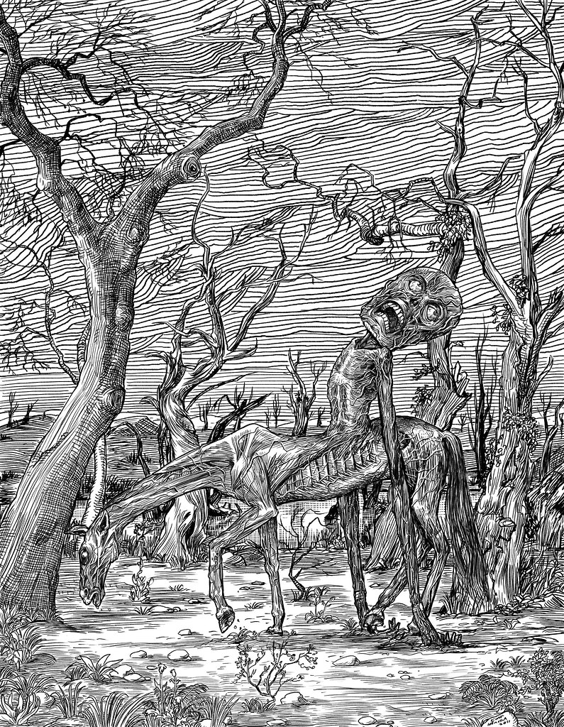
horrible drawing of the Nucklavee and helped me identify it(I had drawn it after reading about it, but then forgot where I had read it). On June 17, 2010, I posted here that I was working on a new version, because I so hated the first version. Well, I got sidetracked, but here is what I worked on today at work and then finished up at home tonight:
It's only been maybe a half hour since I finished it, and there are already things bugging me about it, but I'll let it sit and see what I think tomorrow morning.


9 comments:
I can't see anything that is bugging me. This is great stuff!
As a coincidence I have done some drawings of centauroids too, recently.
Yeah it's really nice ! I can suppose you call bug some graphic node, like the branches seems to be melting in the sky, but it give a strange & nice feeling really
Reminds me of illustrations of medieval knights...or maybe Don Quixote.
fabulous drawing, kurt!
I'm sorry but I think the rendering is uneven and could be more seamless with all the linework merging better. But the muscles and veins are amazing.
I just found out that the word "Nuckelavee" is where my blog gets most of its traffic from.
Yeah, I don't like the sky- it just adds to the confusion and is not drawn particularly well. It's on a layer, and I now think it looks better without it. The tree on the left is inconsistent in style with the rest of the drawing, and I really, REALLY hate how the horse head looks like it's bumping into it. I find that inconsistencies are commonplace in digital drawings, and mostly, I think, because you can zoom in and out while drawing, so then the line/hatching quality is all over the place. It's far, far better to work on an actual page, where your eye can work out technique and composition from a consistent view of the work. I only did this in Photoshop because I was at work and really wanted to start on it.
Thanks for the constructive critiques! That's what I love to read(although, the praising comments are also very much welcome)!
I can't say I'll "fix" this, but I will try and improve it.
It seems that you are not happy with details that may be unbalanced on some way, Kurt. To me, that often just adds flavour.
For some reason this piece reminded me of the surrealism in Matthias Lehmann's work, by the way.
Wow
Nice ... I do like your line style... cool image
Post a Comment