Monday, December 31, 2012

The Hatchet


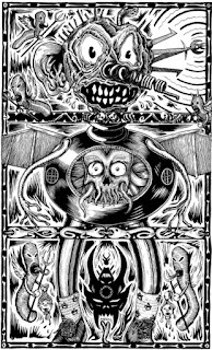
Practicing my brush technique, after a hiatus of a dozen years. It's fun how you will recognice Bosch-ian characters in the paintings of his followers once you have done them yourself. On the left, is a study of a 16th century painting of an unknown follower of Jheronimus Bosch. The title is "hy soect de byle". (he is looking for the hatchet)


Now how cartoony is that? Whether this is a direct copy of one of Bosch's paintings is not known, but there is more earthly folklore in his paintings than is gererally assumed, so why not. It's not all fire and brimstone, mysticism and obscure references to the Old Testament.
The title refers to a common name for a tavern at the time, "The Hatchet". (Note the sign with the hatchet) The boozehound told his wife he went to chop wood, but he was off to the local, instead. . He was then exposed: "he fell through the basket" is a Dutch expression still in use. He is carried by his wife (financially supported?). Their sexual relation is suggested by his empty bagpipes. It is still unclear what the angry, rather butch-looking woman on the right is about, or the curious hobbit-sized archer in the bottom left corner. I'd like to know...

Sunday, December 23, 2012

PORK #9 IS OUT

Interviews with Gary Panter, Kaz, Youthbitch, Mean Jeans, Shawn Pacheco, Matt Stanger & Ben Tipton

More horror book covers

 Just a few this time. I find it interesting how 60s-70s horror paperbacks and magazine sized black and white comics had virtually the same type of art, using a lot of the same artists, many of them selling their art to all sorts of books and magazines all over the world. The amount of swiping in this era is strange, because a lot of these artists were good enough that it makes you wonder why they bothered swiping. There is a vampire face I've seen used on books, comics and maybe even film posters at least in 10 different examples, I wonder what the original was.
 Even though it can get samey I've always loved this classic horror style, but what is annoying is that I've never seen many films and ecountered many books that gave you a satisfying dose of this kind of thing. I used to assume these sorts of stories would be in abundance, but there are very few that really give you what you want.


 cover by Alan M Clark
 Another by Alan M Clark

 Newish Bernie Wrightson cover to an old book
 This one just for oddness.

 Australian comics used to reprint a lot of stuff from all over the world, a lot of it american and south american, I dont know if these had any original australian artists, but many of the covers were original. HERE is an index of Gredown comics, it takes a bit of a while seeing all the covers, but if you like this sort of thing, there are a lot of good ones.


Saturday, December 22, 2012

Inferno silkscreen

Just returned from Portugal, where this here silkscreen print has been done by Mike Goes West, in five colours, on a format of 50 x 65 cm. Quite happy with the results. Also, the Portuguese edition of my book Inferno by Mmmnnnrrrg/Chili Com Carne was presented at the Feira Laica, a neat underground festival in Lisbon:

Friday, December 21, 2012

Angel Cassoulet

Hey kids!

Graphic designer Timothy Georgarakis (from USA, living here south France) started this project long time ago, and it finally get out : it's a book about angels, a flap-book (the idea is to melt faces, legs and body, as you must know), published by Le dernier cri & cut&bound at Le Garage L.

 (please note that this 2 pictures below have been done by Marta Ka, http://mk1977.wordpress.com/, you can see Les frêres Guedin/Craoman show at DC studio, and also a full-lino-printed book by Marie-Pierre Brunel)


This one, also by Marta Ka, show us doing a collective poster, initiated by Charlatan's crew from Genève (Willy Ténia, Lilas Malas, Antonio; plus Julien Gardon, Rémi, and us)


First idea was to do a co-edition but from black/white book it became full-color, so we weren't able to do that way. So it's a DC book bound by us

There's works from our neighbours Timothy (mostly), Quentin Mabuse & his brother Constant, also Rebecca Rosen who's canadian girlfriend of Quentin (she was living here one year), and cartoonist Eric Ferrier. Plus some guests, friends as Benjamin Monti, Marcel Ruijters, Marc Brunier-Mestas, Franck Omer.... and of course DC's staff Pakito Bolino & Yokogaga

The book is full silkscreened, cut & bound by hand, limited to 200 copies, and for sale... uh I'm not sure, 30euro I guess (check www.lederniercri.org)

Here's my contributions, you can see text on first one, this was the first idea but finally Tim let it out :


Thursday, December 06, 2012

Therapy


I spent time spreading colours on paintings I made 10 years ago.

Wednesday, December 05, 2012

Sketchbook #42


Started a new sketchbook a few days ago, as usual with painting the covers. This character was done after Hieronymus Bosch's Adoration of the Magi, which sports not three, but four wise men! This is the odd one out: this guy is thought of as to represent a false prophet from the Old Testament, but nothing is certain. His leg is clamped in a relic holder, as to show a coin-shaped wound on this leg. We don't know why it is shaped like that, but in the late Gothic era leg wounds were generally associated with sin. One would have been bitten by a hound of Hell, so to speak and so this shady character flaunts his sins. In the literal sense, a thief for instance may have been arrested and shackled for some time, the iron chains causing wounds or even gangreen on the ankles.
The high numbers of crippples then make sense, but you always have the feeling of missing out on a lot in Bosch's paintings.

Monday, December 03, 2012

Hello!

Hi there!
This is my first post as a member of "Eaten by Ducks".
Besides having a wonderful name, this blog features some of my favorite artists,
so I'm very happy to be here.

What should you know about me?
Maybe that I don't like to talk about myself too much?
I'm not very good at it, so I'll let my work do the talking.


This is what I've been doing all my life, really.
Drawing or painting characters.
When I was drawing them as a kid, they weren't called "characters" though,
they were called "mannekes". (Dutch for "little men")
(others usually called them "rare mannekes" or "weird little men")


The image above is a scene from a book I'm currently working on.
Basically bringing these different characters together to see what happens.
It'll be a picturebook for geeky adults and cool kids.


Another scene from the same book.
If all goes well, it should be out sometime next year.


Above is the front- and back cover of "Big Pink".
It's a book that was recently published by the French "Graisse Animale".
This book is a selection of work from 2010 until now.
It also features my webcomic "The Core".
If you're interested in this book, go buy a copy here.

I plan to get back on working on "The Core" in 2013.
Maybe something for "Eaten by Ducks"?

Anyway, glad to be here.
Thanks to Marcel for bringing me in.

Later!


Sunday, December 02, 2012

Another annoying defeat

  I was really excited about this one for quite a while, I was sure it would be the best thing I've ever done, but it was just getting worse and worse and I knew I couldnt make it better again because it was fundamentally flawed in some ways I dont fully understand. I was going to call this post something like "another bitterly painful defeat" but somehow it just didnt feel that painful when I gave up and maybe that is a good thing. Perhaps it shows that I really didnt love it that much, even though I was sure this was my best composition idea ever. I've already got loads of ideas about how to rework a lot of this, since even this is a reworking of failed drawings from two or three years ago.
 After I gave up, I quickly scribbled in details to suggest how it might have looked but it cant really show the real dynamics, emphasis and effects the thing was supposed to have.

 I really love doing these large scenes and I have so many ideas for them, in my notebooks I call them "epicscapes" as a shorthand. But they are tricky because I still cant always tell the difference between an impressive visual idea and an impressive visual idea I truly love and want to commit to; because there are lots of cliches in this type of imagery that are too easily leaned on. Although I feel I've delved deep into myself, it becomes apparent how there are still a lot of things I dont know about my cravings, how much I really like things, realizing I dont actually like some things that much etc...
 Perhaps the horses were something I really wasnt that into. Some of you must be familiar with images of giant horses on waves. And it is very easy to get attached to an image you want to do and not be sure of its real merits anymore. I want to talk about this stuff more later in further posts.

 Part of my inspiration for these "epicscapes" aside from obvious influences like Bosch, John Martin, Jack Kirby, Drulliet, Andrzej Masianis and many more, is symphonic music, especially those tracks that take up one side of a vinyl that prog bands do a lot and usually stand as their best achievements; like "Gates Of Delirium" by Yes, "Scheherazade" by Renaissance, "Heaven And Hell part one" by Vangelis and many more. I dont want them to become too predictable in shape/structure, because they should obviously never be boring.
 I thought with the failed drawing I had nearly really captured some of the qualities of those songs and I hope I can still keep those qualities in further attempts.
=========================
==================

 My computer is a bit shitty and it has been having trouble with google and blogger and telling me that the security isnt right, suggesting that this is a false version of the site, or that their security certificate has run out, sometimes not loading pages. I hope everything is fine if I ignore these warnings as errors because my computer has been screwing up in other ways.
 Has anyone else encountered these problems? I really need to use blogger and I still prefer it to other alternatives.