Friday, January 25, 2008

Portfolio Updating Makes Ray a Dull Boy

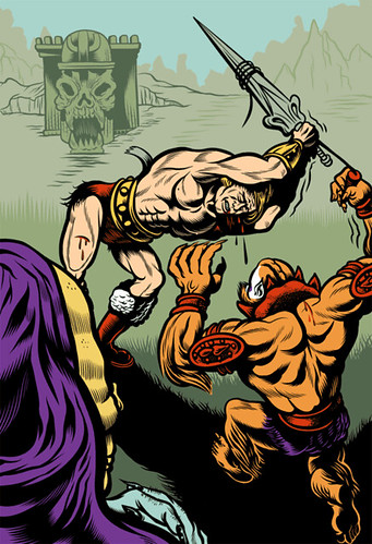
I've spent a fair amount of time the last three or so days working on my portfolio. My linework has gotten a lot better and my color sensibilities have matured a good measure over the last three years. Adding older pieces to round out my portfolio really kills me. I figured, what the hell, I ought to revisit some of these pieces and bring them more in line with my current capabilities. A sort of George Lucas-ing of my old pieces. I redid small bits of linework and updated the colors a tad on the following images (And a few more on my Flickr stream, but I'll spare you all of them).

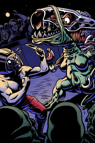
Metal Man Recolor

In the above recolor, I'm attempting to work some texture and soft shading in with my linework. It's got a ways to go, but I like the results of the experiment.
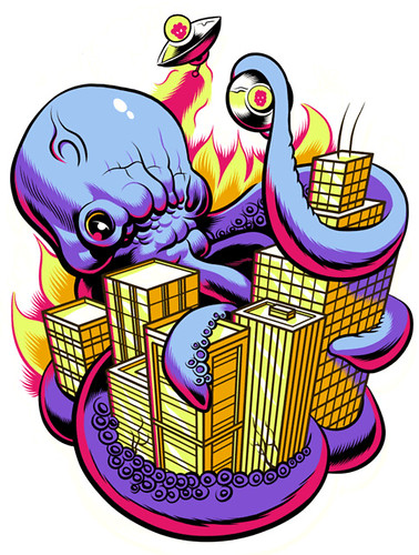
Oddica Octopus

He-Manhandled

While doing this, however, I got stuck in a bit of a rut. Being bombarded by all your foibles over the last few years can hit a guy in his ego! Sometimes, when I need to shake off the cobwebs and get my head back into a creative space, I do something outside of my comfort zone. In this instance, I made a set of "watercolor" tools in Manga Studio and did some portraits of friends. Here's one such attempt:

Dwayne

I really like the result. I'm just not sure what to do with it. I've worked as an art director in the past and I know that if I saw this sitting with the rest of the pieces in my portfolio, I'd be a bit confused. I think consistency of style is important in the way an illustrator markets themselves. I'm a brand, more or less, and there are certain expectations of me. Perhaps I can use it in one of my comics that I'm working on? Maybe I need a pseudonym, eh? Hah.

Blogged with Flock

Monday, January 21, 2008

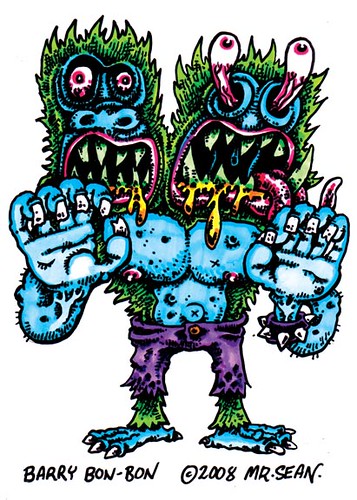
Barry Bon Bon

Gosh, it has been a bit since i posted a new picture up on here.
barry bon bon
Here is a fun two-headed monster to play with!

HOTWIRE #2!


all that and some sunny sidewalk surfer* called David Paleo, don't disturb his siesta or let him know where your door is! he'll camp there with a key!


here's a link where you can check some previews
http://www.hotwirecomics.com/


*Bum

Sunday, January 20, 2008

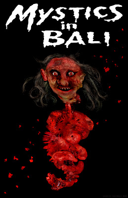
Beware of Flying Guts!!!


I spent way too much time on this SuperTrash poster but I think it turned out good. I originally was sticking to a normal human set of organs which are hidden under all the gore but I started to abstract things into my own weird bloody designs. I covered everything in a thick coat of blood to give it that extra trashy splatterpunk sort of vibe.

Thursday, January 17, 2008

Creative Commonality

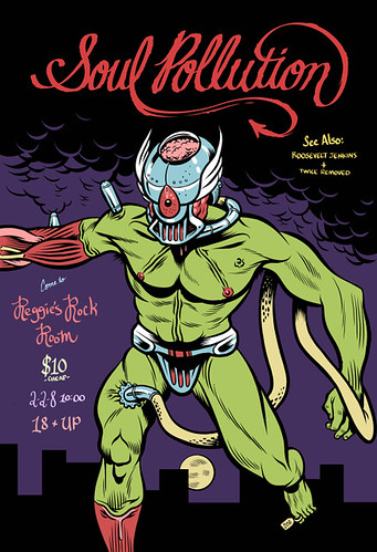
Frankenstein Flyer

If there's one aspect of art shows I don't like, it's that the art is often very costly. As a result, only a select few are able to purchase it which flies in the face of my ideals on a number of levels.

Willfully contributing to this system gnaws on my conscience a little. The circumstances make me wish there was something I could do to change the way people consume my work. I've been toying with the notion of releasing my personal, uncommissioned works under a Creative Commons license.

Unfortunately, a large portion of my income is to be derived from print sales and, now that I'm working as a freelancer full time, I can't really risk that money. Last time I checked, my wife and I like to eat!

A good compromise, I think, is to do everything I can to support other people who have the same goals. I'd like to announce my services free of charge for any band releasing their music under a forgiving Creative Commons license. The artwork I create for the bands in question will also be released under a non-commercial, no derivatives license.

I may not be a good fit for every project and I suspect the amount of people asking for help will be daunting. With that in mind, I hope to help as many bands as possible. I thought it appropriate to start with my friend's band, Soul Pollution, and the above flyer shows a hand lettered logotype and a bonafied-original illustration I created for him.

Leave a link to your Creative Commons licensed album download in the comments on my site (and a contact address in the comment form) and I'll promise to help in whatever capacity my time allows! Flyers, album art, hand lettering - all the things I usually charge for.

I look forward to hearing from you!

Blogged with Flock

Wednesday, January 16, 2008

SuperTrash IT!

Is anyone else submitting work to the SuperTrash shindig? I saw Luke mentioned it a few weeks back in one of David's posts here. I decided to do it a few days ago even though I don't really have the time, but to hell with it, too cool of a project to pass on. I contacted the folks in charge and they're accepting submissions up until Sunday. Check here for all the details. I'm doing a poster for Mystics in Bali! It doesn't get much Super Trashier than that goddamn flick!
Below is a preview of what I'm working on. Currently turning a gut wound in a dead pig into a nasty witch mouth. Not sure which of the above eye types I'm going to use. Blue upside down dead pig eye or halloween mask voodoo eye.

Bulbous mic


This drawing is much bigger than I usually work 'cause it's for an exhibition I'm doing with my pal Dave Birchall at cow lane studios here in salford.

Saturday, January 12, 2008

Frankensteinian Monster


My take on Frankenstein's monster for a friend's band. Hand lettered type at top. Gonna hand letter the show info in the area of negative space to the left, too. So far, so god.

Gonna try to gore it up a little, though!

I've been doing a bunch more hand lettering. It's a lot of fun. My piece in the aforementioned show even incorporates it a bit. Here's another recent example:


I think that getting better at hand lettering will only increase the abilities I can market for and get work doing. The other biggie that I want to get better at is 3D work.

Thursday, January 10, 2008

Dread Pirate Patches Meets His Maker


So, I'm in a show set for this Saturday. Yay! Details here.

The concept behind the show is this: the participants offer personal works with little or incidental commercial value. In other words, do what you want to do, not what pays your bills!

At first, I was a little stymied. I mean, I DO what I want to do for a living, right? A little reflection left me with a clear idea, though. Comics. I love comics, but never have the time to make them. I made a little vignette. Half comic, half piece of art, and that's what I'm printing and bringing along.

I locked myself in my office and finished this last night at 4:00. I am pooped.

Monday, January 07, 2008

Mammoth Logo and Lettering

Mammoth is going to be a clothing brand with a demographic that largely consists of Mixed Martial Arts fans. I was hired to work on the logo and it served as a perfect opportunity to do some more hand lettering.


I'm working on getting better with my hand lettering. In addition to the lettering in the logo above, this was all done by hand:


It's a lot of fun to not be restrained by what fonts you have installed and, rather, to rely on your own ability. I've got a way to go, but it should prove fun to get better.

As is usual, I encourage you to click on the images and get whisked away to my Flickr page. Larger versions are available and the linework looks better in the non-resized, uncompressed version. Hey, what can I say? I'm vain about my linework!

I know that a decent crowd of individuals reads these posts. I'd like to interact more with you guys. What part of my process do you guys have questions about? What would you like to see more of? Less of?

Thanks for feedback, it's always appreciated.

Wednesday, January 02, 2008

My Fallow Year..

I haven't posted any artwork here for a long time. It's not for a bad reason, either; I haven't been making any.
I try though. I sure do. I get ideas. I sketch. I get excited about those ideas
And then I sit down to do it. To get it done. I'm not distracted, I'm not stressed or tired. It just doesn't look good to me.
It never really does. Some of it looks okay, I guess, but what good does that do anyone?
But I keep trying and trying, and it just..slowly..disentegrates...
And it doesn't seem worth it after a while, to be honest.
The next day I'll go in and look over what I'd done the previous day and it looks foreign, like some alien artifact; What was that guy thinking when he drew that?
I have no idea.
Flaccid. Fallow. Forget it.

And then I get to thinking about other medias, other forms I should go after; Maybe purely digital works, collage, maybe screen-printing .Maybe I should learn FLASH.
Maybe I should just write.
Maybe I should forget about feeling like I have to do any of this stuff. Don't other people live like that?
What does it mean to be "creative"? It sounds like fun, but vanity works like that too. What might I be missing out on while I'm burrowed away in a corner, scribbling and scratching?
Maybe I should get a dog.

Photobucket

I hope this next years proves to be more fruitful. Even if that means I leave all of this stuff behind. I

Horror Icons Playing Poker


I've been busy as all get-out. December marks my first month of full-time freelance work in over a year. Cold turkey from here on out - you have my undivided attention.

I'd been working 9-ish hours with 3-4 hours of additional drive time. Now, instead of dividing my time across two business ventures, I'm doing solely freelance.

I bought a great, large format, archival quality printer and I intend to start selling prints, more frequently update the blog (including a one hour long narrated podcast as soon as I figure out the most economical/practical way to host it), and really kick 08 in the ass.

I spent all day yesterday soliciting agents and hammering leads, and I can't wait to get started.

To try and balance out all this word smithing, I have a couple of shots from a forthcoming personal work, tentatively titled, Horror Icons Playing Poker. I've always been enamored with Dogs Playing Poker. What's not to like? Dogs? Check. Poker? Check. Fisticuffs to ensue? Check.