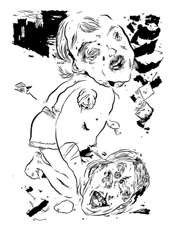
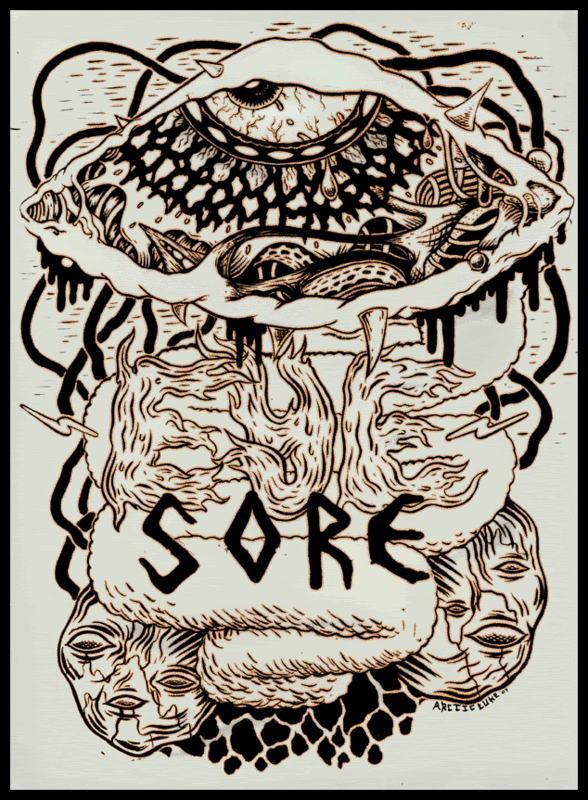
I’m taking a slightly different track with my insanely popular top 5 feature; I’m breaking it up into individual “reviews” that I’ll post as I finish, and, instead of simply listing ‘stuff’ that I really like, I’m going to use items; comics, movies, shows, various media, etc., that I’ve been ‘into’ as springboards into ideas that I’ve been thinking about a lot lately. Hopefully, this’ll provide a more tangible link to our shared world of comics, art and all that stuff, with what might otherwise read like the random blather of the crazy-eyed old man that’s at the coffee shop every time you go there. And, really, it reflects the way I actually view most of this “stuff” .
As I age, I look upon all of this stuff that somehow piles up in every nook of my apartment with less and less of the unchecked enthusiasm of my adolescence, when I looked to art, comics and music to somehow provide for me an identity and , consequently, ate up whatever ideas this stuff inspired in me, as long as it pushed the right buttons, indulged my perception of self, creating a kind of feedback loop of feel-goodism that ran tighter and faster as it went on, spitting out all alien bodies that might infect it*. I see it now in that annoying air of overblown self-confidence you see in people in their late teens or early twenties, who’re also at the coffee shop every fucking time you are.
It became pretty clear that it was an entirely false-conciousness - life experience, exposing myself to ideas that ran counter to those I basked in, or having them foisted upon me – this broke the spell , so to speak.Without sounding too melodramatic, I’ll let you know that it was painful and confusing. I thought I had stuff figured out: Each night after work or school I’d dig a few of my buddies out of the pile of stuff in the corner and we’d hang out for hours, telling each other how awesome we were. It’s like, somewhere along the line, I nodded off for an hour and woke up to the sounds of my pals murmuring plans in foreign accents involving my ass and the highest bidder. The party is over.
Even though the party was over I had a need for this stuff; For a while it felt like I was digging through ashtrays for lipstick-stained roaches, but I eventually decided – even after hosing away the vomit on the back porch- that there was too much promise there.Promise for what, I can’t really say. I promise I’ll drop the party analogy now, that’s for sure, because that keg is all foam.
So, how do I approach all this stuff from now on? Do I refuse all materials that don’t expose my murky cave-like brain to pure, shining brilliance? – That sounds good sometimes: Pure, Concerted, Disciplined, No Bullshit, etc..
But I’m reminded of something one of those really smart guys wrote about artists “They’re damned to be of their time but not in it.” ( paraphrase, of course.I honestly don’t recall who wrote that.) .
From the front door of the house I grew up in, you could see the hulking neon backside of
My towns’ mall. It was full of video games and movies and candy and comics and monster magazines.It was my second home. I once came to, wandering the parking lot in my pajamas in the middle of the night. I wanted whatever was in that place, even while I was sleeping. I was an addict by age ten.
( I still have dreams about wandering through that mall ( now an office building/warehouse) and finding the coolest comic book you’ve ever seen. It’s usually kind of psychedelic looking, with lurid colors and thick black inks. I set it aside to dig for more and when I turn to retrieve it, it’s gone, somewhere back on the rack.)
- All this crap is in me, but I’m not of it- Or is it the other way around?
Asking me to refuse anything resoundingly unbrilliant is like asking a retarded fat kid to jump rope and recite a monolouge from King Lear (That analogy is actually too close to the reality of the subject to work properly, but I’m going to stick with it cause I’m too dim-witted and hungry to think of a new one)**- It’s just not in me, or of me, or in the time of me that I’m not in but of, or whatever the fuck.
-And all that junk led me somewhere, I think; even if it consisted primarily of escapism, it was an escape to somewhere where you might find some nugget of value in there among the tits and skulls.It at least set the stage full of props and imagery – stuff that I could use on my own...
I’ll get to the point: the only way I can really engage all of this stuff is with that same schism in mind that caused this mess, only now refurbishing it as a critical tool.
- It’s the disparity between my perception of reality and what I think the material is trying to communicate to me about reality. It’s pretty direct, it’s pretty literal; I’m a pretty literal-minded guy ( yes, I am comfortable with that.)
I’m pretty comfortable with my ideas about what looks good; I think I know good drawing when I see it. I’m pretty sure I can recognize formal invention as well as clunky storytelling.- This stuff is the parsley on the real meat of the matter. That meat is the content***; In terms of comics, it addresses the fundamental reason for their existence, which is to communicate something, weather it’s some obtuse tone-poem in panels or a chart depicting the life cycle of a self-loathing Canadian .
- So, let’s figure out what it’s telling us, what it’s communicating either by design or default and let’s use our God-given sense of reality and truth to figure out wether we value the message or not. I do this not because I want to shit on people, or out of jealousy ( I am jealous of many good artists, not the ones I shit on..) , I do it cause I’m after the promise of something meaningful that stopped me from throwing all of my stuff in the trash when the bubble burst .It involves determining what has value, what has none, what has a little,etc.,etc.
It seems obvious and it is -BUT- I seem to encounter with some regularity a willful reluctance among people my age to engage art in terms of personal value.They either adopt some feigned sense of objectivity in which value is determined by their sense of how “culture” might interpret something ( and it’s usually the most novel interpretation that finds favor), or they indulge in what seems like magical thinking, by which , through occult means, we will any minor tingle of pleasure into meaningful-ness; It’s the language that a shittily traced rendering of Garfield “speaks” to an art school drop-out somewhere in New England.
They are both de-personalized.they are both steeped in irony.It’s the kind of irony that consists soley of embracing the inverse perception of the actual, the opposite of the expectations that we’ve based on a sense of shared reality ( and these expectations are valued only as much as they can be confounded, blah blah).It disengages the ironicizer from the ‘other’, or the ‘expector’ and allows whoever ‘gets it’ entry into the “in crowd”.You’re either in or out.
Have you guys ever read the kind of criticism that actually asks questions like, “Is it good for comics?”, like you have to nurse the abstract phantom to health to train it for gold, or, “Did they achieve their objective?” , regardless of wether you approve of their objective ? -which is like training the phantom for gold in the Special Olympics, i.e, egalitarianism run amok .
Sadly, it seems like the majority of “professional” criticism falls into this camp.It’s often mere inches away from mentioning Box-Office numbers right before a “tuned-in” description.
If this straw man I’ve built is the difference between ‘pro’ criticism and amateur, I’ll go with amateur; I’m not interested in being a functionary critic, an administrator of “even-keeled” , rationi-ized criticism. What the imaginary citizen of an imaginary “culture” might make of of something cannot begin to have any meaning to me. I remember Alf and neon sunglasses and I like acting like an idiot with my friends, but this stuff isn’t valuable to me- it’s a diversion.
I take this stuff personally. I have to.It’s a part of my character, and, what the fuck- it’s all I’ve got.
*- I think a lot of artists try to keep that feel-good loop going. In fact, I sometimes suspect that keeping that going and operating within it is what is often recognized as
“dedication” and is met with “success”.
** Actually, the analogy doesn’t work at all. It does reflect the murkiness I live in well.
*** Yes, I know , content is drawing, is “aesthetics” ( I shudder every time I use that word..),etc.,etc.,.

1.1. NATIONAL WASTE #6
I’ve argued with people who’re really concerned with the “ecosphere” a few times and I’ve come away with the idea that they’re motivated in part by an image of this static state of pure “nature”, uncorrupted by the hell other people bring- all those careless, greedy people with their SUVS,etc.etc.- and that this is the vision they’re defending from those who look upon their claims with skepticism. It’s a place where all life can live according to it’s nature, away from the pretense, ego, greed, ignorance and hubris that define humanity at it’s worst.
It’s pretty easy to compare this vision of nature and mans’ role in it to the appeal of Outisder Art, or Art-Brut; an unaffected method of creating art that’s simultaneously the concerted creation of one individual- you can see ‘Natural” mans’ hand at work-, but too disinterested in what others ( with the hell they bring) might care for to be considered solipsistic.It makes no concessions to what might be considered artificial constructs of beauty , to notions of skill and craft ( egotism?) or to the cultural traditions that brought them about; if the hell of other people has a home, it’s there.
Lief Goldbergs’ National Waste series features short comics with ecological themes drawn in an Art-Brut style, familiar to fans of Fort Thunder, of which Goldberg was a central figure.
The first strip, STICK SPACESHIP, involves a helmeted bureaucrat leading a ‘pep rally’ of identical helmeted men within a domed, sterile complex. The “pep rally” involves nothing more than instructions for achieving “inner happiness” by modifying a series of mechanical pre-sets- I surmise-within their own identically programmed minds.They’re returned to “infinitely pleasurable production mode”. The “stick Spaceship” of the title has been hovering above the dome all the while. A giant anthropomorphic bird appears, flying around the head of the ‘leader’ ; “Gaia ..sendsss a gift”, it says. A scuffle breaks out; other bird creatures crash through the dome, helmet-heads are separated from necks and the leader is flown to “the lions’ den” somewhere out in the wasteland.
STICK SPACESHIP, like the rest of the NATIONAL WASTE, is drawn in scratchy pen lines; what looks like some bic pen here, some Uni-Ball or Sharpie there. The rest of the strips involve awkwardly drawn anthropomorphic and human characters inhabiting a squalid, waste-world, living off the refuse of a consumer culture whose sweat pants are ready to burst from too much toxic sugary useless crap.
I do think people damage the environment, but I don’t think “nature” is a static , pure state that man can only corrupt and I’m a little weary of a college-educated artist ( one educated at RISD, no less ) taking on a naïve bent in their artwork, but I can’t dismiss National Waste so easily- there is something there that I really respond to; the world built in National Waste is funny,odd and provides an infinite canvas of possibilities. This is, at it’s core,a work of science fiction .Unlike the majority of science fiction, it focuses on the hapless idiots that have to live in the wake of major social change and have had no hand in it’s creation- they might not even understand any of it, much less be able to do anything about it. Stuff just happens- that’s all they know, and that’s all we’re shown.
I don’t buy the environmental concerns in the comic. Even though it’s obviously an exaggerated, comic-booky world, I think it’s a little too simplistic to say anything I value - and- here’s the crux- I’m not sure if the Brut trappings of his comics allows for much nuance. The STICK SPACESHIP story, for instance, is a mere 7 pages long and reads more like a series of snapshots , or a high-light reel of the best moments of the story. On one hand, it cuts through the bullshit, get’s to the fun stuff; it makes no concessions to the reader. On the other hand, it makes no concessions to the reader.
That’s what’s got me in a tough spot with not only National Waste, but a lot of the art comics that sprung up in the wake of Fort Thunder; There’s a certain vitality and energy that comes with eschewing traditional storytelling techniques and craft concerns, on the other hand, these traditions became such because they worked, they helped give people what they wanted in a comics reading experience; something the reader could immerse themself in without being jarred out of by seeing the artists’ hand everywhere, or in clumsy panel transitions. In the world of National Waste, would this be a concession to commerce? To tradition? Hmm.
It’ll be fun to watch art comics like National Waste evolve.I wonder if we might see some of the older practitioners of this kind of work attempt to stretch the bounds they’ve set . This is my projection, of course; I’m pretty sure I’d get bored if I didn’t move along after a while.
I’d like to see the same level of craft and care that’s so obvious in the screenprinted covers of National Waste ( worth the price alone) applied to the cartooning. I want the contents to look as good, I want to see Goldbergs’ world fleshed out enough to hang around in for a while, to see enough space in the stories for the unexpected to occur, along with the ridiculous and exciting.
National Waste #6 is available from
Quimby's Online Shop
-Cover of a recent Goldberg project
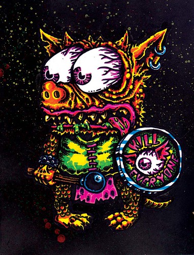
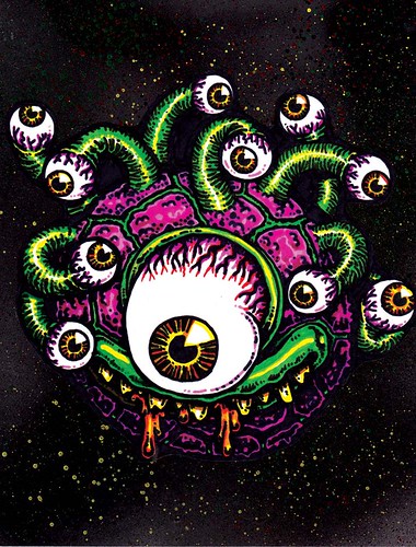
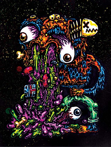


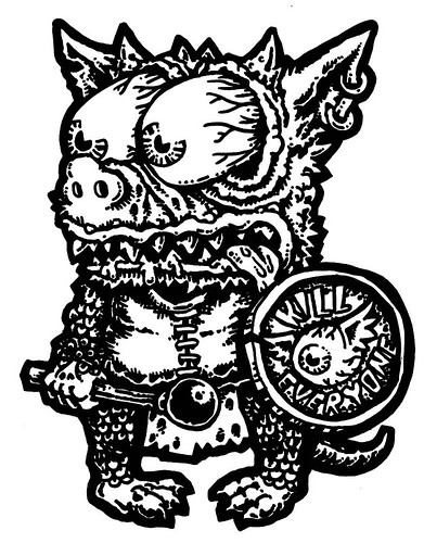
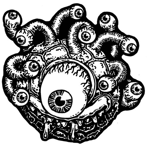



 Here's about 100 sketches for my series of 1,000 monsters that I'm still not sure what I'm going to do with. I need to do a lot more experimentation with book binding before I'm comfortable with doing a run of books for this. I'll be using these a lot to reference for various characters in my Hob Bob comic, I'm going to try to incorporate every one of them in one way or another. Some will probably be characters that I use a lot, others will get background cameos. The one that looks like it's split in half has inspired me to do a weird tribe or village of characters that are all split in half but fit back together when they're in danger. That's going to be fun to draw. I might make all the buildings split in half too. Maybe have some giant golem creature that's in two giant halves that all the townsfolk need to push back together to fight for their plot of land against whatever invaders come their way.







 Posts
Posts