
Saturday, May 31, 2008
Crunchy Beats!
One of the crunchiest beats known to mankind was made by none other than John Carpenter.
For more extremely crunchy beats, play the first track on here by Luke Eargoggle. And if you're still hungry for another bowl of captain crunch beats, play some Mos Deaf and Massive Attack - I Against I or Whodini's Haunted House of Rock.
And then there is possibly the crunchiest beat driven song in the world..
Friday, May 30, 2008
Le Dernier Cri's 9th Hopital Brut!
I plan on contributing and I think some of you might be interested as well. Here's a message I received today from Le Dernier Cri..
And I'll just take this opportunity to say.. I love Le Dernier Cri, if it was a woman I'd marry it and have a bunch of mutated babies with it.
"next we 'll publish the new hopital brut number 9 !!!!!!
And I'll just take this opportunity to say.. I love Le Dernier Cri, if it was a woman I'd marry it and have a bunch of mutated babies with it.
"next we 'll publish the new hopital brut number 9 !!!!!!
number 9 ...number 9 ....number 9...for 2009 ...9 ISSUES IN
THE YEAR...9 DIFFERENT KIND OF PAPER INSIDE ...
9*9=81 pages for each issue...silkscreen
cover and quadri / trikro/bikro/dirrect color ofset and
silscreen ......at the end put all on them in a box and you
get the monster....
size 24 cm/32,5 cm...or 24cm/16,25 cm ...
(9.5 /12.6 inch ...OR 9.5 /6.40 inch )
all the contributors can send what they want all the year
...
we need 9 differents cover with the tittle ...
it could be some story or art who can run during the 9
issues...
limited edition of 500 copies...each artist get one....
sorry no more time and place for storage .... first dead
line end of october
....first issue in january....and after we will explose
.....number 9...number 9 ....number 9...
send this information to everybody who can like this stupid
idea !!!!!
/TO THE END OF 2009 / 9 ISSUE IN 12 MONTH !!!
DEADLINE EVERYDAY !!!!!!TO 2010!!!!!!!"


Thursday, May 29, 2008

Wednesday, May 28, 2008

Inchworm Album Art
Inchworm, a local (Chicago), indie band that, in their own words, "...mixes psychedelia, rock, and folky singer/songwriter stuff into a savory blend of original music," recently hired me to create the art for their forthcoming EP, Silent Observer.

Click the above image to enlarge.

Click the above image to enlarge.

Cover detail.

Back cover detail.

Inside detail.
Brian Morissey, a band member and my primary contact on the job, wanted a cover that incorporated various thematic elements from the songs on the album. Naturally, my first request was for a copy of the songs. Even without a specific call to incorporate the themes of the songs into the art, it's absolutely necessary to hear a band's music and get a feel for them. By proxy, you can make inferences about the type of people listening to the album and what sort of art might ring true with them. I think my background as a print designer makes me see all jobs as branding jobs on some level which isn't necessarily a bad thing.
Staying true to the band and their audience while giving things my own unique spin makes album art a pretty collaborative process. Managers, band members, and, depending on the label or the agency handling things for the label, art directors all bring something to the table.
The music industry is a bit of a different animal than most my work. Pay rates seem to be down across the board and a lot of the managers, specifically, just want merch and they want it yesterday. I sometimes get a sideways look when I ask to hear the band's music and voice my intention to send over multiple roughs and concepts. IE, "Just draw something, eh!"
If I get that sort of vibe, I respond accordingly and do the best I can with the materials and time provided. Ideally, I'd pass on all such jobs, but, hey, we all have bills to pay and a few sneak in. Luckily, this job had more in common with the vast majority of commercial illustration that I do. I did some initial thumbnails which I didn't think to upload, but otherwise have a shot of each step below.


Getting the colors done right was a little tougher. You see, I have a bit of a case of the neons. I love bold, saturated, secondary colors that really have no conventional right to sit next to each other. They're not right for every instance by any means, but my natural inclination is to pursue them and at least try them on for size.
With some back and forth with the band, I settled on something with a more limited palette. Using fewer colors and highlighting only the important bits of the characters and props strengthened things quite a bit. In the end, I'm really happy with how it turned out. I can't wait to see it printed!

Click the above image to enlarge.

Click the above image to enlarge.
Cover detail.
Back cover detail.
Inside detail.
Brian Morissey, a band member and my primary contact on the job, wanted a cover that incorporated various thematic elements from the songs on the album. Naturally, my first request was for a copy of the songs. Even without a specific call to incorporate the themes of the songs into the art, it's absolutely necessary to hear a band's music and get a feel for them. By proxy, you can make inferences about the type of people listening to the album and what sort of art might ring true with them. I think my background as a print designer makes me see all jobs as branding jobs on some level which isn't necessarily a bad thing.
Staying true to the band and their audience while giving things my own unique spin makes album art a pretty collaborative process. Managers, band members, and, depending on the label or the agency handling things for the label, art directors all bring something to the table.
The music industry is a bit of a different animal than most my work. Pay rates seem to be down across the board and a lot of the managers, specifically, just want merch and they want it yesterday. I sometimes get a sideways look when I ask to hear the band's music and voice my intention to send over multiple roughs and concepts. IE, "Just draw something, eh!"
If I get that sort of vibe, I respond accordingly and do the best I can with the materials and time provided. Ideally, I'd pass on all such jobs, but, hey, we all have bills to pay and a few sneak in. Luckily, this job had more in common with the vast majority of commercial illustration that I do. I did some initial thumbnails which I didn't think to upload, but otherwise have a shot of each step below.
Getting the colors done right was a little tougher. You see, I have a bit of a case of the neons. I love bold, saturated, secondary colors that really have no conventional right to sit next to each other. They're not right for every instance by any means, but my natural inclination is to pursue them and at least try them on for size.
With some back and forth with the band, I settled on something with a more limited palette. Using fewer colors and highlighting only the important bits of the characters and props strengthened things quite a bit. In the end, I'm really happy with how it turned out. I can't wait to see it printed!
Monday, May 26, 2008

Goblin's Armpit
With all this talk of zines, i'm putting out the 20th anniversary issue of Goblin's Armpit this summer. This coincides with my obsession with 1988, the year my life changed forever as my parents got a divorce & i stopped seeing the world in the same way. 1988 was the year i discovered the AKIRA comic & movie, the Dark Knight Returns, Clockwork Orange & college radio when it was still pretty intense & subversive (lots of hip hop & industrial & punk & heavy metal shows). The zine should traverse through the different stages of Goblin's Armpit, from Subgenius & RPG obsession, to budding Punk rocker Hip Hop Acid House weirdo phase, 1989-1992, to full on Punk Rock bad attitude 1993-1995, to post-apocalyptic medieval Punk period 1995-1997, to Satanic heavy metal gothic futurist period 1997-1998, to totalitarian futurist period 1998-1999. The zine then took a ten year hiatus as i was involved in numerous other projects. Something about 2008 really says that this zine needs to return, i'm not sure what it is, but it is also saying that all of these different periods need to meld together into something new & crazy.
Sunday, May 25, 2008
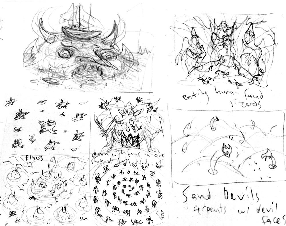
More Sketches
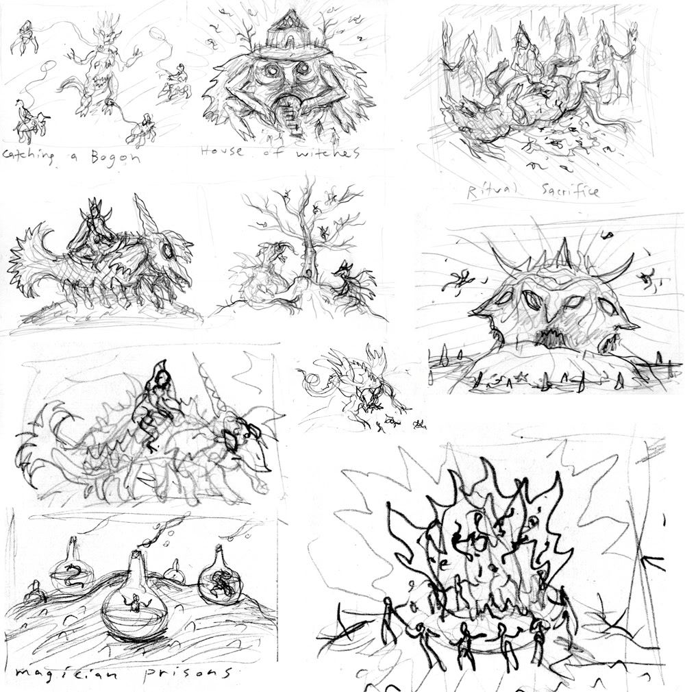
Ok, a few more brain storm pages worth of scratch marks, some of which I'm turning into full color drawings. The bottom right corner of the pic above is one I'm really excited to work on. It's going to be a circle of headless demonic creatures dancing around a giant fire in which their heads are flying around inside the flames.
EBD zine

I started a strip for Sean's EBD zine today, here's the first page in a sickly coloured version. The title of the strip's gonna go on the front of the desk.
Saturday, May 24, 2008
Discrete Funk

Hi fellas. I'm Jason Overby, and I'm the new guy here. This's probably gonna be the first page of a comic I'm working on right now. Let me know what you think.
Friday, May 23, 2008
Hedorah the Smog Monster

This is a version of Hedorah I did in my sketchbook at a meeting today then fiddled with in photoshop at home.
HOORAY! I sort of finished something!
"Now, when the day goes to sleep and the full moon looks
The night is so black that the darkness cooks
Dont you come creepin around - makin me do things I dont want to"
Peter Green - The Green Manalishi

The night is so black that the darkness cooks
Dont you come creepin around - makin me do things I dont want to"
Peter Green - The Green Manalishi

Thursday, May 22, 2008
Money money
OK, so heres a topic to discuss. How do people here who self publish, get the cash to do it. blood, 2nd morgages, grants, paper routes? cough up the secrets if you gots em.
A is for Arf!
 Here's one of a handful of letters I did for Craig Yoe's newest Arf, Comic Arf. With these as inspiration I'm going to do a full demonic alphabet with a variety of odd monsters tormenting people from A through Z.
Tuesday, May 20, 2008
Pickled Punks
Greetings folks! As always, outstanding work here!! Anyhows, I just realized I hadn't posted here in awhile. It was suggested earlier that I post some pics of my 3-D work, so here's a couple photos of some of my pickled punk sculptures. These are all under 10," not including the jars, and are made from air dry and polymer clays and painted with acrylic.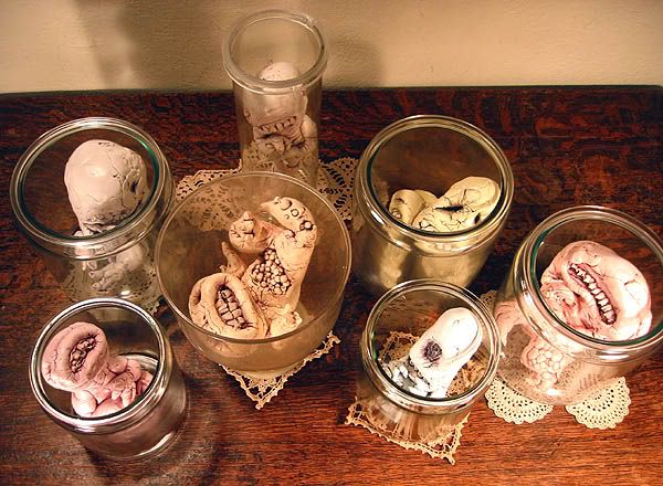

Monday, May 19, 2008


Sunday, May 18, 2008

Saturday, May 17, 2008
sodaplay
Just stumbled across this amazing site where there's different critters to play with....
check it out!
http://sodaplay.com/
Also thanks to all the Duckers who've sent stuff for the VV book, all the work's in now and we're busy putting it together.
check it out!
http://sodaplay.com/
Also thanks to all the Duckers who've sent stuff for the VV book, all the work's in now and we're busy putting it together.
Thursday, May 15, 2008
Volke Splande

This is a tshirt design I've done for The Wire magazine. The design's called 'Volke Splande' if anybody's innerested it's available from here:
Dawuvn

Hey people, killer stuff lately.
Check out my dear friends Mujercitas Terror's Myspace page, Rock From the South End of Nowhere!
Something(s) old
I had a four-panel strip that was no good. Drew it. Hated it.:
PANEL ONE -
Doctor is unwrapping patient's bandaged hands.
DOCTOR: Unfortunately we did have to amputate. We were, however, able to find a donor in time for a transplant. A Mr. Paul Lee Riley.
PATIENT: (Shocked) PAUL LEE RILEY!?!?
PANEL TWO -
Close up of patient's face.
PATIENT: Isn't he the infamous river-side strangler? You gave me the hands of a killer!!!
PANEL THREE -
Doctor is still removing bandages.
DOCTOR: Oh, no, no, no. Not to worry...
PANEL FOUR -
Medium shot of patient with "hands" unwrapped. Patient is disgusted.
DOCTOR: ...he only dontated his kidneys.
Anyway, here's a drawing of Muddy Waters from about 5 years ago and some 10-year-old drawings. Meh.


Wednesday, May 14, 2008
Who What Now
I've been really caught up in my Beasts! Book 2 stuff lately but will soon be returning to a series of small paintings that I almost finished last fall. I've taken a lot of inspiration from miniature paintings from the 14th - 15th centuries and plan on exploring some additional small painted compositions, possibly on wood. And I have another series of larger paintings I've been thinking about for awhile of demon/devil faces on black backgrounds. I have some really awesome devil masks that I've made from bent wire which I'll be adding materials onto and covering in some lacquer like stuff and painting. The goal is to have a few of those finished to sell around this fall for Halloween. And I have my fill of digital visions and bits of Hob Bob stuff here and there that fill into the cracks. I'll be posting some paintings in the next week or so.
Also, I've been listening to a lot of music off of www.lovefingers.org The mixes on there are always amazing. If you're making some art, throw this on http://www.lovefingers.org/mp3/snow.mp3 The INXS Mediate/drum beat mix halfway through is especially good.
Also, I've been listening to a lot of music off of www.lovefingers.org The mixes on there are always amazing. If you're making some art, throw this on http://www.lovefingers.org/mp3/snow.mp3 The INXS Mediate/drum beat mix halfway through is especially good.
Eaten By Ducks Zine
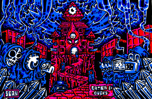
Okay, so i'm going to throw together an EATEN BY DUCKS ZINE. I'm debating about whether it should have a theme or not. But the above image is the cover, done in my new "SINCLAIR ZX SPECTRUM" style. There will be a color back cover, & color inside front & back, so let me know if you want to do one of those. It'll be standard half-size, so final work should be black & white, bit mapped, 300 DPI tiff fitting to 8"x5", whatever page orientation you want. Deadline, soon.
Quickies


I did these very quickly with a bamboo stick and a Japanese brush. Maybe it's the beautiful spring weather, but I have been having a hard time working on long-term projects. Just the idea of working on something for so long drives me insane. Anyway there's some pieces coming up that, when finished, should be pretty cool-or maybe not.
No Graven Image

Thanks for the comments on my last post everyone. Since Sean and Chris brought it up again, I think I need to clarify a little why I'm not doing the pychedelic/abstract approach with my Cthulhu portraits. In this instance I'm not so much interested in illustrating what Lovecraft tries to convey in his stories. I've written elsewhere on this blog(*), and here I completely agree with you, that I see a great problem with finding imagery for the cosmic existential horror that is at the core of HPL's vision, exactly because it is meant to be indescribable. Portraying it only limits its scope and makes it something familiar. Kind of like there's a prohibition for likenesses of god in most monotheisms. I'm not saying it hasn't been done successfully btw; Aerons photoshop monstrosities are but one example.
But I'm taking the opposite route, starting with Lovecraft's description of a statuette -
A pulpy, tentacled head surmounted a grotesque and scaly body with rudimentary wings [...] It represented a monster of vaguely anthropoid outline, but with an octopus-like head whose face was a mass of feelers, a scaly, rubbery-looking body, prodigious claws on hind and fore feet, and long, narrow wings behind. This thing, which seemed instinct with a fearsome and unnatural malignancy, was of a somewhat bloated corpulence...
- and playing around with what the creature which is portrayed here, might look like. It may sound paradoxical, but the series as a whole is basically a comment on how none of the portraits actually can come close to the "real" thing. The series started off when I was playing around with an idea for a comic featuring Cthulhu (as a person, not a nameless horror) and made several sketches of him. The first ones were more or less the stereotypical images you find all over pop culture, so I tried to come up with as many anatomical permutations as possible. Of course, some of them are closer to the description and some of them are fairly different, but you could imagine humans making a statue of something they can't describe more "anthropoid", simply because they're humans themselves, misinterpret antennae as wings and so on.
I'm thinking of making a little book out of the whole series at some point, maybe silkscreen with an additional color or something.
* as far as I remember as a comment to Luke's post about Clark Ashton Smith, which I can't seem to find - was it deleted for some reason?
Tuesday, May 13, 2008
Grafitti on Non-Euclidean Walls
Cthulhu sketches:


I've added some more finished Cthulhus to the Human Mollusk blog. Here's one I did several months ago and didn't like back then. Perhaps I thought it looked too much like a medieval demon instead of a Great Old One. Looking at it now I don't think it's all that bad, but I'm still not sure it if I should include it in the series.

I've added some more finished Cthulhus to the Human Mollusk blog. Here's one I did several months ago and didn't like back then. Perhaps I thought it looked too much like a medieval demon instead of a Great Old One. Looking at it now I don't think it's all that bad, but I'm still not sure it if I should include it in the series.
Subscribe to:
Posts (Atom)

