I'm working on a new series called Dungeon Degenerates. I'm using monsters from Dungeons & Dragons & similar games. Somewhat in relation to my previous post about maintaining the funk & fuzziness & mystery in our cultural output, i am so bored by the current style (which has really been going for almost 20 years or so) of Dungeons & Dragons art. Even when they were still using actual paint as opposed to photoshop to render these worlds, there has been a
decidedly inhuman, overly-rendered, muted color, overly distorted & over-all gay feeling to all of it. While i think i like Arthur Rakham's work & even the work of his copiers like Brian Froud, within his style are the seeds of this infestation. The seeds of nutlessness. If you want to see an ideal form of RPG art, check out
Warhammer 40K Rogue Trader, 1st Edition.
Grell
The grell levitates through the dank corridors of the dungeon hoping to paralyze its prey with the poisonous spines on its ten tentacles. The Grell's powerful beak can crack open its victim's skull so that it may feast on brains.
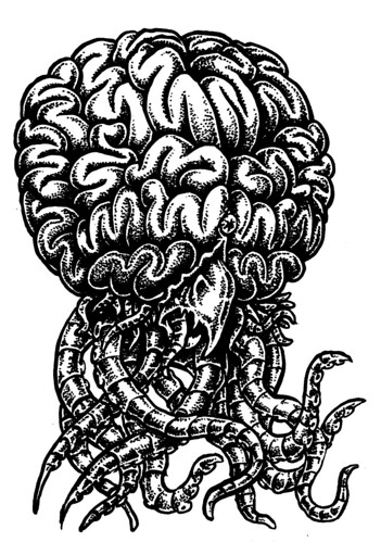
They enjoy above all else, a potion made from crack & LSD.
Bullywog
A batrachian race of bipedal monsters which inhabit wet places - rainy forests, marshes, damp caves or virtually any other place which is shady or dark and has water nearby, for bullywugs need to dampen their skins from time to time.
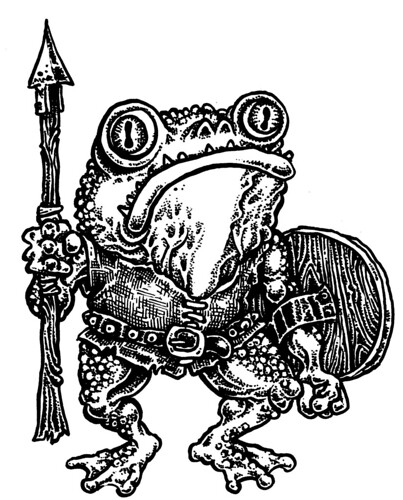
The Bullywog is the favorite food of the Umber Hulk.


14 comments:
I was about 5 years old when I saw an amazing Dungeons and Dragons picture and it appeared to be a depiction of everything I ever wanted at the time and it really hit me like a tonne of bricks, the size of the dragon and the amount of spikes it had drove me crazy. When I saw it as a t-shirt, I begged for it and I wore it for years til I was bursting out of it and it was all ripped at the seams, I wanted to keep it as just a picture but mum threw it out.
Occasionally I would see art by what looked like the same artist, and I've tried to find out who it is over the past few years with no luck, since there are so many damn books that I could never find out who.
But this post prompted me to find out and it was Jeff Easley who did that image...
http://www.drachenserver.de/dragonimages/postcards.php?image_id=1278&sessionid=ecb2bc88e2e68e7bbc0a81e8714acf7f
...and next week I'll be saving lots of his pictures.
I also bought that Paul Bonner book I was pondering over and I dont regret it.
I dont connect with this stuff as much as other horror/fantasy art, the exaggeration often alienates me, even in Paul Bonner and a lot of Simon Bisley lookalikes, I just cant put myself in that world when everyone looks so humorously exaggerrated, I'd like to, but I cant. The big butch guys are liviing out your heroic fantasies yet the artist is calling them dumb muscleheads,, i dont like that.
I'm not a fan of comedic fantasy, I dont hate it either, but it usually takes away the WOW factor that I want. I remember someone accused Terry Pratchet of ruining fantasy with this, but you cant blame one guy for the bad excesses of the next generation.
I definitely think the art in rpg has gone downhill, but that is the way it goes in every artistic trend in a general way.
Most of the thrill of seeing that Jeff Easley image was being able to imagine myself in that situation, and I guess that is what I have looked for ever since,, I dont understand why anyone would want to stay outside the image and look at it like an abstract Picasso and not able to put yourself in it.
As for your art Sean, I can walk around in some of them, but I think I can smell them, which makes it somewhat real to me.
I hope this wont offend you, but I've always thought you looked like a guy from an rpg. I could see you carrying an big axe.
Niiiiice!
I heart old school D&D for real.
A while back my pals and I did a zine inspired by the creatures in the OG Monster Manual. Dig it...
http://geegar.blogspot.com/search/label/%22Chaotic%20Neutral%22
I'll send you one if you're into it.
Shaka!
-Paul
These are great Sean! I've always loved the Grell. Hope to see more...
Hey Paul! That "Chaotic Neutral" zine looks awesome. Some excellent work there. And some of my favorite D&D monsters too.
Great characters, Sean. I love the buldging tentacled Grell brain (who would have figured?).
While I like some of DiTerlizzi's drawings, I agree that they're all in all pretty kitschy, even for children's book illustrations. However, my problem with them is not the degree of rendering, distortion or over-all gayness, but a sense of false, dishonest cuteness that pervades them. The grotesque creature drawings are generally better and more imaginative than the images containing cute children, animals or fairies, so I suspect that's where his fascination lies and the rest is hackwork. I think the more nauseating aspects of his art are mostly a symptom of a the sickly-sweet paradigm of what children's book art should look like today.
Have you ever looked at any books illustrated by Chris Riddell, he's quite good IMO. http://www.chrisriddell.com/index.php?option=com_content&task=view&id=21&Itemid=76
I've listened to audiobook versions of the first three volumes of the Edge Chronicles which he illustrated. The stories are very enjoyable, too, and chock-ful of weird creatures.
Can't say I care much for the warhammer 40k cover. The colors are pretty aweful in my opinion. Are you sure it's not mostly your nostalgia speaking? I always dig the miniatures tho.
Robert, i think that's one of Easley's rare alright pieces. I always thought that dragon looked weirdly anthropomorphic. I see Easley as the beginning of the decline into professionalism of AD&D. Check out Errol Otus & Dave Trampier's early work (before he started to do Wormy which is basically a furry comic). I'm glad you can smell my pieces. Also yes, i could definitely live in a fantasy world with an axe & kill things all day just to pass the time.
Paul, cool stuff. I'd love a copy, i'll trade ya for some cool crap.
mine address is pobox 12044 Eugene OR 97440 USA
Fufu, i agree about Diterlizzi. I think i liked his stuff when i first saw it because it was new & it was a departure from the late 80s AD&D art, but it soon wore on me because of that small eyed, spaced far apart, Rakham Froud rip off etc etc... this was before he started to draw kids books. I wasn't talking about the cover of WH40K, i didn't make it clear, but i'm talking about the guts of the book. The interior is out of control. I think i just found it in pdf form so i'll post some if that works out. There seems to be a theme of me being blinded by nostalgia on here, it doesn't happen.
Sorry for the insinuation, Sean. I really thought you were talking about that cover painting.
Surely the Warhammer cover is more "gay", with all the macho guys with big thrusting guns.....
Gay doesnt equal lame, at least not in my world.
For what its worth,Errol Otus was the god of early D+D art.
Nice drawings Mr Goblin -
The original "Monster Manual" hit me like a bomb when I was a kid. I thought, and almost still do, that it was the greatest book that had ever been made. It's weird, I was going to mention Erol Otus and David Trampier too as some of the best RPG artists I had seen but Sean beat me to it. David Sutherland III did some decent work in that early MM too, especially some of his demons. A little rough and sketchy but still pretty cool.
I can't even bring myself to look at anything put out by TSR (or whatever the fuck they are called now) or Magic the Gathering at all. It's pathetic, toothless and neutered. So obviously shackled to a corporate-mandate house style designed to do nothing but look the same and move product. It makes me fucking sick.
Anyway, I really love these pieces Sean. They are so true to the spirit of those early "Monster Manual" pieces. I'd really like to see more.
Sean, how big are these finished pieces? I'm just curious.
No offense taken Fufu. Just wanting to be clear.
Cornelius, the word gay has lots of definitions, when i'm not speaking about someone who is actually gay, but using gay as an insult, it means weak assed & sissified. Most of the actual gays i know aren't weak assed or sissified, but if i want to insult them i can just call them little bitches. The WH40K cover, which isn't what i was enthusing over, but the actual contents is almost heterosexually gay, which is what Conan & probably myself is/are. That is homoerotic. But, one man's homoerotic is another woman's good lay. I totally agree about Errol Otus. He rules. Period.
Matt Kish. Thanks. I agree completely. I bought a few hundred magic the gaythering cards the other day because it was like 2$ for 400 cards or something & i wanted to redraw them. One interesting thing is that Ian Miller actually did some art for them. So like 1 out of every 300 cards is cool. Like them odds? ha ha. The finished pieces are about 7"x5" to be shrunk down to card size.
sean - i basically agree with you about the use of "gay" as an insult - its not the word but the intention behind it thatsd offensive, and i didnt think for a minute that you were trying to be homophobic.and anyway, im hardly the most politically correct person - ive been known to use the word "spastic" to refer to things before now, and most gay men i know, myself included, use "thats really gay" as an insult. but then perhaps we are allowed to......just really pointing out that we should think about the words we use and the context they are used in.
most fantasy art hasa heightened sexuality - it is fantasy after all - but i was just pointing to something way more "gay" than lame airbrushed/digital renderings of dragons and big tits.i bet those marines have a good old time in the showers after all that killing..........
the mind boggles as to what "heterosexually gay" means....
ive been visiting this blog for a few months now and im very impressed - some great talents here, and always thought provoking
I'll have to admit to charges of Nostalgia on all that Easley enthusiasm. But I do think he has a strength in depicting landscapes of furious heat and the scenes he shows are exciting when you think about it, if not executed as well as I would like.
That is what bothers me about most fantasy art: Is that I have to think too hard to be a part of the excitement.
A lot of the Prog, Metal and Hard Rock music gives me the type of thrill I want the art to give me.
Most of my attention given to fantasy art is wanting to like it.
It actually taken me a while to "get" Frazetta, I used to think he just looked "old" and boring when I first saw his work when I was 12-17. I think Frazetta needs a little concentration, but it rewards.
I think your favorites you just mentioned are decent, but they dont grab me by the balls the way I want to be grabbed. Your presence on this blog has always made me want to do my own in the hope I could excite people as if they were living it.
Despite my reservations about Paul Bonner ((I like him 70%, but a lot of the cartoon exaggeration still puts me off))), I think this one works and is a fine example of what I want to see...
http://www.conceptart.org/forums/showthread.php?p=1733365
...The cartooniness works for me here, I can laugh at those wolves, but they are still cool and I can feel their bloodthirsty exciement up on that mountain, it makes me want to get some swords, grow long hair and run around the mountains singing.
I'm not bi-sexual, but I LOVE the homoerotic apects of fantasy art. That is what I like about Corben, is the guys dicks are swinging around as they fight, it's just cool.
All this talk is encouraging me to hurry up my own sword and sorcery art, but with more of a black metal flavour. Black Metal cover art usually does it for me.
Believe me Cornelius, it's been well thought over! Sometimes "gay" is the only thing that will work. And yes, very few women in space... i suppose that was what the space squats were for.
Robert, I checked out that Bonner piece... something very wrong about it. He switched into this almost hyperreal style in the late 90s when he stopped working for Games Workshop. Something about the color & the overly rendered quality to it that bugs the shit out of me. His compositions don't do it for me either. My favorite piece he ever did was for a solo adventure published in white dwarf, it was pen & ink, or very up-contrasted pencil drawings & had a mix between his fantastic caricatures & attention to detail with a rougher quality to the rendering... i'll scan some if i can't find it online. When i was 13-15 i thought i wanted to draw just like Paul Bonner but as i saw his style tend towards this decadence i realized that i really love the rough around the edges thing & devoted myself to that. I can't wait to see your new pieces related to this discussion.
Post a Comment