One of a strange species from Hob Bob, the bubble gutz come in all shapes and sizes and have translucent bubble like bodies. They absorb random wildlife unfortunate enough to get stuck in their bubblegutz.
Friday, June 06, 2008
Bubble Gutz
One of a strange species from Hob Bob, the bubble gutz come in all shapes and sizes and have translucent bubble like bodies. They absorb random wildlife unfortunate enough to get stuck in their bubblegutz.
Thursday, June 05, 2008
SCIENTIST RIDS THE WORLD OF THE EVIL CURSE OF THE VAMPIRES
Here's a few solid tracks from my favorite Scientist album, with one seriously awesome cover. I love the idea of these guys chasing Dracula, The Mummy, Frankenstien, The Wolfman, and a horde of zombie creeps out of the swamp by the power of fat ass dub reggae beats. Eat some dub you undead mothers!
Scientist - The Voodoo Curse
Scientist - Your Teeth In My Neck
Scientist - The Corpse Rises
Tuesday, June 03, 2008
Monday, June 02, 2008
Color!
A Note of Introduction
Hi All. My name is Jeffrey Meyer and I was invited by Luke to join the blog - thanks to him for thinking of me and thanks to everyone else for all the great art you've posted here. I've been reading "Ducks" for about a year now, I guess, and I'm really impressed with everyone's work - you all have such distinctive, accomplished styles. It's very inspiring, so I'll do my best to contribute work equally interesting... I hope. I recognize many of you from various places online, in particular the Comics Journal message board.
To be honest I haven't been drawing regularly for about three years now; from about the ages of 15-30 it was like a religious obsession for me, but then one day I just sort of... stopped... there were all sorts of reasons (and excuses, I admit) but I found myself very frustrated with my abilities and my imagination (and, of course, lack of success). So I began to make collages to amuse myself. After a couple years of this, I was surprised to find that not only was the process of making art enjoyable again, but I was actually impressed with the results - it's remarkable what happens when you have no expectations about the finished work, and you don't have to exercise your hands and eyes like an athlete. Of course I'd like others to be as impressed as I am, but I understand collage is not everyone's cup of tea... Funny, though, good drawing is still my favorite medium to look at, there's just something about it that really grabs me, and I have the utmost respect for people who draw well.
At any rate, I'm not sure what kind of work I'll be putting up alongside all of yours, but if you'd like a look at some of what I've already done, please visit my site here.
Nihilistic English Bubblegum
This is an old Sex Pistols interview record, just a fan product to make some extra money off of, but the cover is so perfect. The Sex Pistols' manager Malcolm Mclaren pulled a Warholian avant garde underground art/cultural event as commodity before the Sex Pistols even had a chance to properly dissolve & become part of history. With Jamei Reid executing this larger vision, you've got something quite weird & quite wonderful.
The Great Rock&Roll Swindle is seen as one of the most terrible movies ever made, but i just love it. It's so English.
Saturday, May 31, 2008
Crunchy Beats!
One of the crunchiest beats known to mankind was made by none other than John Carpenter.
For more extremely crunchy beats, play the first track on here by Luke Eargoggle. And if you're still hungry for another bowl of captain crunch beats, play some Mos Deaf and Massive Attack - I Against I or Whodini's Haunted House of Rock.
And then there is possibly the crunchiest beat driven song in the world..
Friday, May 30, 2008
Le Dernier Cri's 9th Hopital Brut!
I plan on contributing and I think some of you might be interested as well. Here's a message I received today from Le Dernier Cri..
And I'll just take this opportunity to say.. I love Le Dernier Cri, if it was a woman I'd marry it and have a bunch of mutated babies with it.
"next we 'll publish the new hopital brut number 9 !!!!!!
And I'll just take this opportunity to say.. I love Le Dernier Cri, if it was a woman I'd marry it and have a bunch of mutated babies with it.
"next we 'll publish the new hopital brut number 9 !!!!!!
number 9 ...number 9 ....number 9...for 2009 ...9 ISSUES IN
THE YEAR...9 DIFFERENT KIND OF PAPER INSIDE ...
9*9=81 pages for each issue...silkscreen
cover and quadri / trikro/bikro/dirrect color ofset and
silscreen ......at the end put all on them in a box and you
get the monster....
size 24 cm/32,5 cm...or 24cm/16,25 cm ...
(9.5 /12.6 inch ...OR 9.5 /6.40 inch )
all the contributors can send what they want all the year
...
we need 9 differents cover with the tittle ...
it could be some story or art who can run during the 9
issues...
limited edition of 500 copies...each artist get one....
sorry no more time and place for storage .... first dead
line end of october
....first issue in january....and after we will explose
.....number 9...number 9 ....number 9...
send this information to everybody who can like this stupid
idea !!!!!
/TO THE END OF 2009 / 9 ISSUE IN 12 MONTH !!!
DEADLINE EVERYDAY !!!!!!TO 2010!!!!!!!"
Thursday, May 29, 2008
Wednesday, May 28, 2008
Inchworm Album Art
Inchworm, a local (Chicago), indie band that, in their own words, "...mixes psychedelia, rock, and folky singer/songwriter stuff into a savory blend of original music," recently hired me to create the art for their forthcoming EP, Silent Observer.

Click the above image to enlarge.

Click the above image to enlarge.

Cover detail.

Back cover detail.

Inside detail.
Brian Morissey, a band member and my primary contact on the job, wanted a cover that incorporated various thematic elements from the songs on the album. Naturally, my first request was for a copy of the songs. Even without a specific call to incorporate the themes of the songs into the art, it's absolutely necessary to hear a band's music and get a feel for them. By proxy, you can make inferences about the type of people listening to the album and what sort of art might ring true with them. I think my background as a print designer makes me see all jobs as branding jobs on some level which isn't necessarily a bad thing.
Staying true to the band and their audience while giving things my own unique spin makes album art a pretty collaborative process. Managers, band members, and, depending on the label or the agency handling things for the label, art directors all bring something to the table.
The music industry is a bit of a different animal than most my work. Pay rates seem to be down across the board and a lot of the managers, specifically, just want merch and they want it yesterday. I sometimes get a sideways look when I ask to hear the band's music and voice my intention to send over multiple roughs and concepts. IE, "Just draw something, eh!"
If I get that sort of vibe, I respond accordingly and do the best I can with the materials and time provided. Ideally, I'd pass on all such jobs, but, hey, we all have bills to pay and a few sneak in. Luckily, this job had more in common with the vast majority of commercial illustration that I do. I did some initial thumbnails which I didn't think to upload, but otherwise have a shot of each step below.


Getting the colors done right was a little tougher. You see, I have a bit of a case of the neons. I love bold, saturated, secondary colors that really have no conventional right to sit next to each other. They're not right for every instance by any means, but my natural inclination is to pursue them and at least try them on for size.
With some back and forth with the band, I settled on something with a more limited palette. Using fewer colors and highlighting only the important bits of the characters and props strengthened things quite a bit. In the end, I'm really happy with how it turned out. I can't wait to see it printed!
Click the above image to enlarge.
Cover detail.
Back cover detail.
Inside detail.
Brian Morissey, a band member and my primary contact on the job, wanted a cover that incorporated various thematic elements from the songs on the album. Naturally, my first request was for a copy of the songs. Even without a specific call to incorporate the themes of the songs into the art, it's absolutely necessary to hear a band's music and get a feel for them. By proxy, you can make inferences about the type of people listening to the album and what sort of art might ring true with them. I think my background as a print designer makes me see all jobs as branding jobs on some level which isn't necessarily a bad thing.
Staying true to the band and their audience while giving things my own unique spin makes album art a pretty collaborative process. Managers, band members, and, depending on the label or the agency handling things for the label, art directors all bring something to the table.
The music industry is a bit of a different animal than most my work. Pay rates seem to be down across the board and a lot of the managers, specifically, just want merch and they want it yesterday. I sometimes get a sideways look when I ask to hear the band's music and voice my intention to send over multiple roughs and concepts. IE, "Just draw something, eh!"
If I get that sort of vibe, I respond accordingly and do the best I can with the materials and time provided. Ideally, I'd pass on all such jobs, but, hey, we all have bills to pay and a few sneak in. Luckily, this job had more in common with the vast majority of commercial illustration that I do. I did some initial thumbnails which I didn't think to upload, but otherwise have a shot of each step below.
Getting the colors done right was a little tougher. You see, I have a bit of a case of the neons. I love bold, saturated, secondary colors that really have no conventional right to sit next to each other. They're not right for every instance by any means, but my natural inclination is to pursue them and at least try them on for size.
With some back and forth with the band, I settled on something with a more limited palette. Using fewer colors and highlighting only the important bits of the characters and props strengthened things quite a bit. In the end, I'm really happy with how it turned out. I can't wait to see it printed!
Monday, May 26, 2008
Goblin's Armpit
With all this talk of zines, i'm putting out the 20th anniversary issue of Goblin's Armpit this summer. This coincides with my obsession with 1988, the year my life changed forever as my parents got a divorce & i stopped seeing the world in the same way. 1988 was the year i discovered the AKIRA comic & movie, the Dark Knight Returns, Clockwork Orange & college radio when it was still pretty intense & subversive (lots of hip hop & industrial & punk & heavy metal shows). The zine should traverse through the different stages of Goblin's Armpit, from Subgenius & RPG obsession, to budding Punk rocker Hip Hop Acid House weirdo phase, 1989-1992, to full on Punk Rock bad attitude 1993-1995, to post-apocalyptic medieval Punk period 1995-1997, to Satanic heavy metal gothic futurist period 1997-1998, to totalitarian futurist period 1998-1999. The zine then took a ten year hiatus as i was involved in numerous other projects. Something about 2008 really says that this zine needs to return, i'm not sure what it is, but it is also saying that all of these different periods need to meld together into something new & crazy.
Sunday, May 25, 2008
More Sketches
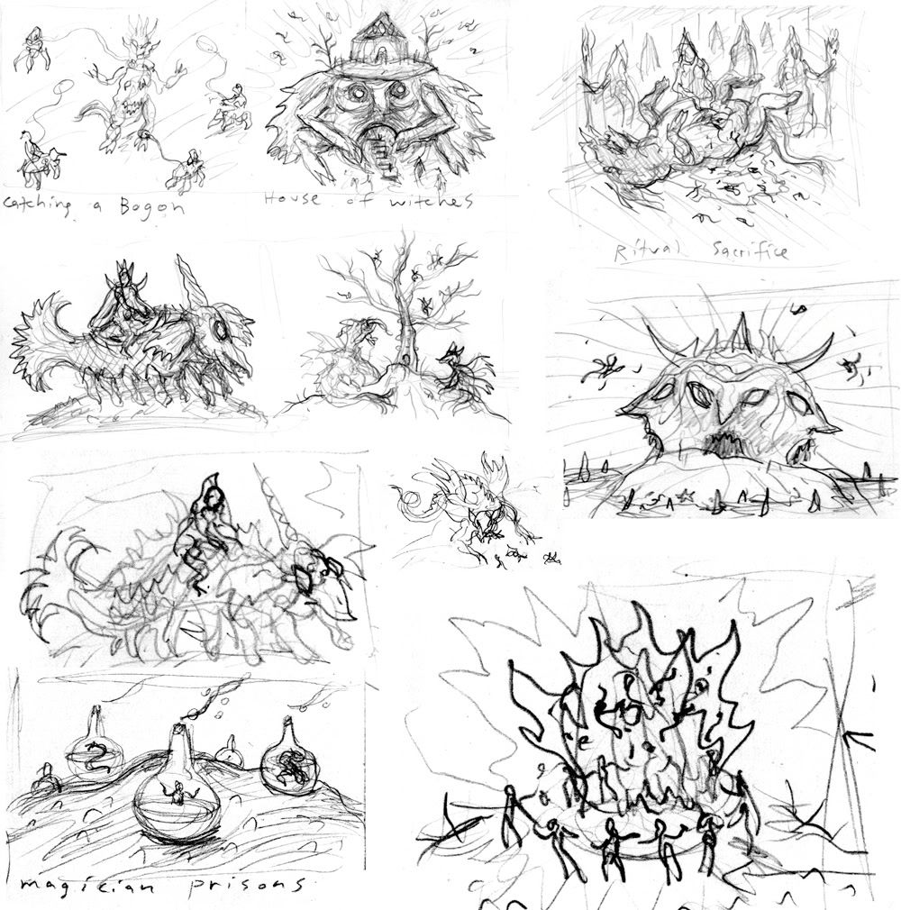
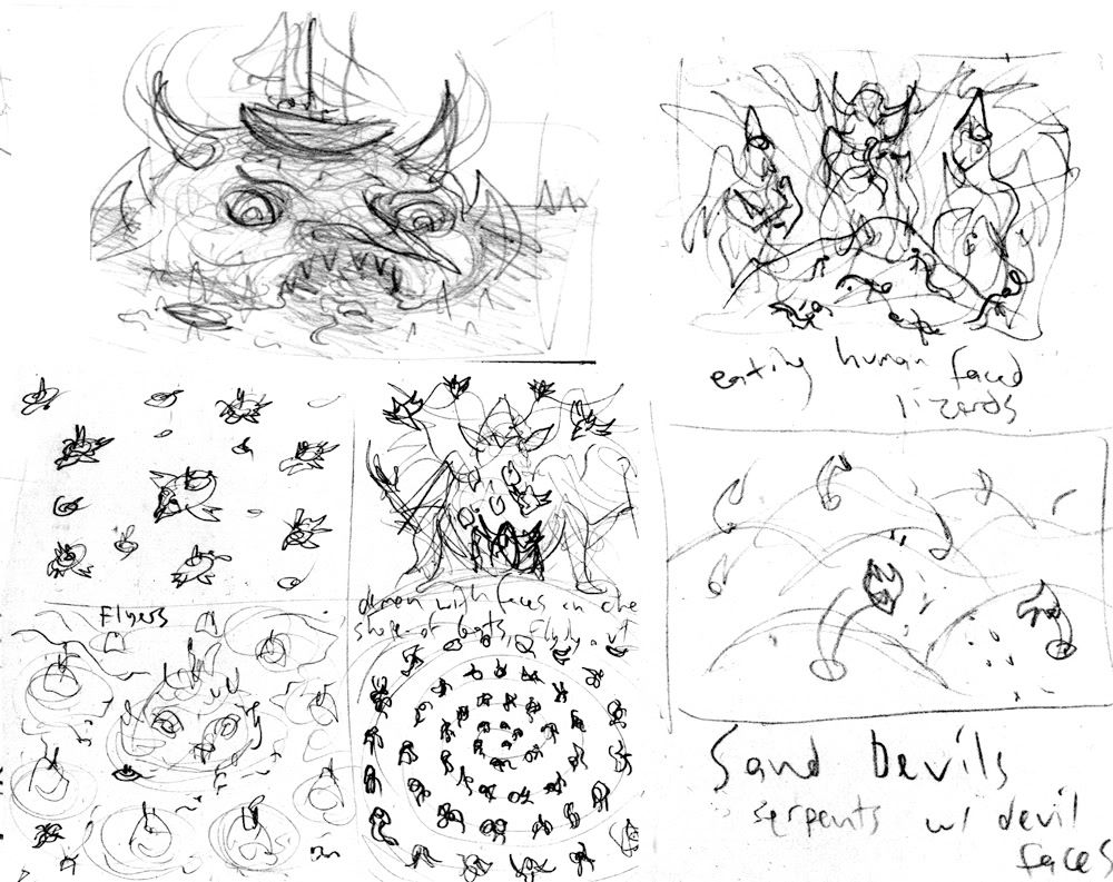
Ok, a few more brain storm pages worth of scratch marks, some of which I'm turning into full color drawings. The bottom right corner of the pic above is one I'm really excited to work on. It's going to be a circle of headless demonic creatures dancing around a giant fire in which their heads are flying around inside the flames.
EBD zine
Saturday, May 24, 2008
Discrete Funk
Friday, May 23, 2008
Hedorah the Smog Monster
Subscribe to:
Posts (Atom)