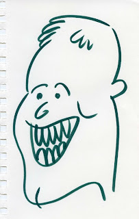
Just a few scraps from my sketchbook this time - obviously nothing major, but what the heck. I'm always a little intimidated by the work I see you fellas post - I fear my own stuff is a bit too clean and cartoony to fit in.
The bottom image is my first attempt at coloring in Photoshop. I literally have no idea what I'm doing there... I suppose there are plenty of tutorials online? In fact, I think Ray may have posted some himself? Any guidance you guys can offer would be appreciated, thanks.
At any rate, I'll have a big new collage to post at some point in the next few weeks - unfortunately it's a gift for someone, so until it's framed and given to her on her birthday, I can't let her see it here or on my own site (just thought I'd mention it so you can get all excited in advance, LOL) (yes, I just typed "LOL").
.jpg)

.jpg)
.jpg)
.jpg)
.jpg)
.jpg)
.jpg)


7 comments:
I like the cartoony flat color stuff- don't worry about "fitting in". It'd be pretty boring if we all drew monsters...
Amusing portraits, Jeffrey. I don't do a lot of color stuff on photoshop but I have a tweaked out method of burning and dodging highlights and detais in my digital collages that I noticed translated well into color work. Open one of these files in photoshop, copy the image and paste it as a new layer. Then go to the layers tool bar menu in the upper right and select the option bar there that should have a default setting of "normal" then drag it down to overlay. This effectively cancels out the negative space of white around the image. I usually use this effect to drag in extra details under details for various textures but it works just the same for color drawings. Just be sure to readjust the color balance, hue, etc under the image bar then select "adjustments" to change the colors without even touching the paint brush tool.
I'm sure Ray has a books worth of awesome tips.
I like the eyes in the green piece,cool. As far as photoshop is concerned,that is old news, mess around with it and maybe you will develop your own unique approach- there is no right way. And the less you know the better. However the filters are a tricky thing because unless you use them the appropriate way they can be lame looking. So stay away from the filters, man.
please dont worry about being too clean or simple. I love the simple color on the green guy. Dont have to do the tricked out stuff that someone like Aaron does. just have fun. good job.
Thanks, guys.
Forget Photoshop, the first two drawings are really good!
Although the really clean ones are definitely cool, my favorite is the sketchier dude with the glasses. More please!
Post a Comment