
Wednesday, September 17, 2008
Chad Van Gaalen
-Ripped off the link from the MeatHaus blog. I really like the drawing, the character designs, and the narrative is pretty neat too. I'm excited by this kind of post-Fort Thunder ( am I identifying myself as an old stodgy dork by even using this term?) drawing. You lose a little bit of the primacy, but I like how it's being refined and actually put to use in readable narratives. What was once seen as radically stupid is becoming fairly mainstream. Pretty soon we'll get some Adult Swim shows that look like this stuff. Devin Flynns' stuff on SuperDeluxe is already on the radar..
Tuesday, September 16, 2008

reversed skull

 +
++
Help needed: I’m searching for information about batches of snots who used the upside down skull as a sign.


Saturday, September 13, 2008
From Beyond!!
Have you guys checked out the recently released Directors' Cut of Stuart Gordons' From Beyond yet?

I'd seen the film before. I think Aeron sent it to me a while ago.I can't say I can break down the exact differences between the regular release and the Directors' cut, but I assume it had to do with the overt sexual material and the close-up eyeball sucking type stuff.
It's an amazing movie. I might be sort of biased because I pretty much love everything Stuart Gordon has done , though I tend to focus on his Lovecraft material, which From Beyond is among; I haven't seen Robot Jox or King of the Ants and a couple of others.
I'm not sure that tension is adequately built enough to provide any genuine scares, but I'm not sure that was the major concern. I think the gore/monsterism was seen as providing that effect, but I'm pretty much immune to that at this point. Witness:


The effects, the ultra-lurid color scheme, all of it is a thrill to me.
I'm not going to break down the story cause I'm lazy, but my favorite buts are the hospital sequences where the Jeffrey Combs character goes through a bizarre and genuinely freaky transformation.
He gets hungry.

The visual of the bandaged, completely hairless Combs, with an oddly bulged-out skull, wandering through the hospital in a kind of trance is just fucking awesome. How's that for valuable criticism?
Go see it and tell me what you think.
Friday, September 12, 2008
I Dream Of The Underworld In Paint
Oy, I've been drawing all week but don't have access to a scanner right now, so here's a text only post.
So I had this dream a few days ago after drinking a lot of alcohol where I was wandering through a skyscraper in New York that was supposed to have a passageway into the Underworld in an abandoned apartment. The weird thing is I found the entrance through a broken wall behind which I could see the gateway into the Underworld but it was a giant painting. There were vivid blues coloring a circular rock tunnel entrance and inside a deep brilliant red colored Cerberus posed menacingly at the center. I usually forget my dreams when I wake up so it's interesting to still have this image in my head. I'm going to have to paint it sometime and see if I can't actually use it as a gateway!
So I had this dream a few days ago after drinking a lot of alcohol where I was wandering through a skyscraper in New York that was supposed to have a passageway into the Underworld in an abandoned apartment. The weird thing is I found the entrance through a broken wall behind which I could see the gateway into the Underworld but it was a giant painting. There were vivid blues coloring a circular rock tunnel entrance and inside a deep brilliant red colored Cerberus posed menacingly at the center. I usually forget my dreams when I wake up so it's interesting to still have this image in my head. I'm going to have to paint it sometime and see if I can't actually use it as a gateway!
Tuesday, September 09, 2008
New Pen

Mike Canich found a pen that I have been looking for for like 5 years. Called the Pentel Pocket Brush Pen. Can only find at Wet Paint in St. Paul MN. I ordered one and played with it. Fellet compelled to go back to realism which I didnt like so I simple started wandering with the pen, thus ended the hand of this guy. Such a different feel for me from my normal static line work.
Edd Cartier's "Travelers of Space"


 Hey everybody, thought I'd plug one of my favorite blogs: Mr. Door Tree's Golden Age Comic Book Stories, which features, in addition to old comics and comic covers, amazing classic book and pulp illustrations. The examples above are from a recent post about pulp artist Edd Cartier. I thought many of you would get a kick out of them, as they're pretty Lovecraftian, and beautifully drawn and printed. Anyhow, enjoy, and if you dig this sort of thing, check out his blog on a regular basis.
Sunday, September 07, 2008

Minocracy:::Cotoreich


Nadaiihin Rein. Minocracy. Ronéo Printed in the Cotoreich workshop’s slammers and syrups. Silkscreened folder. Adrien Fregosi : cotologo, sweat and hullabaloo. 40 copies approx.
Thursday, September 04, 2008
Crazy Old Japanese Cartoon
Speakin o cartoonz, you gotta check this one out. More specifically, watch the insanity that plays out from the 5 minute mark
A horde of giant snake beasts, shooting bullets out of their forked tongues? at a giant robot character who puts a handful of weird characters inside its hollow chest, turns into a tank that flattens one of the snakes. Then we see a horde of demonic bats with Mickey Mouse heads in the sky. One is attacked by a group of bees with spears that stab it in unison, causing it to explode into a mouse headed skeleton bat that falls through the sky. Then the rest explode into skeleton bats and fall out of the sky. I live for scenes like that! Get to the 2 minute mark and check out that Mickey Mouse character riding the Mickey Mouse headed bat blowing a horn, great stuff.
Wednesday, September 03, 2008
Paul Bunyan

I've really gotten into Paul Bunyan lately. I found a fantastic collection of Paul Bunyan stories from 1947 chock full of the Real America which is really inspiring. It's a bit weird for me, because i was a pioneer in the whole eco-Punk element & really bought into the whole environmentalist line during my brief flirtation with all things leftist. Having grown up & seeing what it actually takes to keep people going, & re-aligning my interests with the American working class, i understand that there's conservation which is good, & then there's environmentalism which is a college campus based semi-religious ideology that is misanthropic at its core.
Anyhow, Disney, which i have a love/hate relationship with covers all of this old Americana territory, but they didn't do it with the proper guts, gusto, nuts, grit, grime & aggression to sustain the nation. They do about a "half castration" in the 50s, while today they do a "complete gender reassignment surgery".

Alchemy Garage
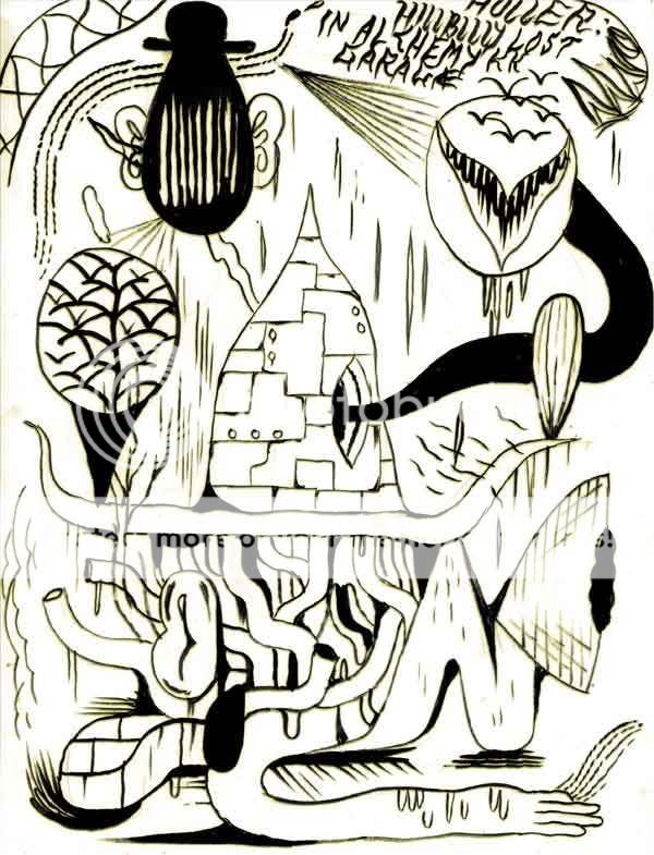
-From sketchbook.Click to enlarge.
I've been doing a lot of really loose brush and ink drawings lately while trying to work on larger, more concerted efforts at the same time. Problem is, I really like the sketchier stuff a lot more, both in terms of finished product as well as enjoying the process.Drawing without preparation kind of goes against my grain in a way; I tend to appreciate in art a certain kind of cleanliness of approach.Not the look of it, but just the sense that it's directed, that you can discern clear intent.
The problem is that when I attempt that kind of thing I become mired in strategic thinking.I bounce so many possibilities around in my head that I basically loose steam.It's no longer about enjoying the process of drawing or painting or whatever, but instead it's about trying to pin down something really elusive. Like trying to catch a phantom with a bear trap or something.
I struggle against it all the time. Comics are still my favorite art form, probably. They're strategic by nature. They even involve grids, usually. I think like a lot of people, I really want to create things like the things I most enjoy, but at this point I sort of think it's just not in the cards. I can write them. I've written out full scripts that I think are pretty good, but when it comes to executing them, I end up with lifeless, dull illustrations.
I think my goal at this point is just to let things go. I hate the word, but an organic or wholistic approach to art and drawing, where it's woven into my daily life and just sort of happens is something to shoot for. Now I have to nail down how to do that.
It never ends...
Tuesday, September 02, 2008
Two new sketches from the Inos sketchbook


The top small sketch for God Emperor of Dune was based on a description of a audience that took place in the underground fortress in the city Onn. The composition of the sketch was inspired by Japanese prints that quite often use the birds-eye-view perspective and my own experience in the ancient palace in Kyoto. I decided to minimize the size of Leto II in the sketch and make him a part of the environment. The God Emperor is particularly hard to illustrate, it's hard not to make him look like a turd with a head. Artists have shown Leto II in a variety of ways, my addition was to fully incorporate him into the royal carriage, as called in the book.
Lastly, I gave him a mask, I thought it would cater to the idea of ceremony and divine status.
Lastly, I gave him a mask, I thought it would cater to the idea of ceremony and divine status.
The sketch below is a study for another ink called "The Lovers."


On & On Til the Break of Dawn
Here are two new screen prints I am having done. These are just scren shots - I will post images of the posters when I get them in a couple weeks. These are to be released October 4th at a solo show I am having here in Main at the Frontroom Gallery. They are "Thromming Goddess" and "Thromming Castle." They should be hot at 18" x 24".


Monday, September 01, 2008
STALKER -- Super Trash

Here's something I've done as a submission to Floating World Comics' Super Trash film festival -- a poster for Andrei Tarkovsky's Stalker, one of my favorite films.
If you're familiar with the film, hopefully the imagery here makes some kind of thematic sense. The film is about - in the simplest terms - a journey to a room that is purported to grant your deepest wishes. At one point a broken light bulb appears in the film; I liked the familiar notion of light bulb = idea, so I started with that, then enlarged it to represent the room where ideas become actual.
I wanted to evoke the slightly psychedelic Eastern European film posters of the era (60s-70s) so I threw a watercolor wash behind the drawing that hopefully suggest this, as well as imitating the color palette of the film: mostly greens and blue. The film is also filled with water imagery, so I left the linework transparent. I experimented with color in the light bulb and logo, but I wasn't as pleased with the results.
For Tarkovsky's name I questioned if I should simply use one line near the logo, or somehow design his credit to further suggest the film's images and themes. I repeated the line of text until I had a block of text that looked less like words than it did the tangled rows of electrical wires, fencing and train tracks that pattern the film. However the image was a little harshly edged as it was, so I faded it into the color as you see here.
Were this a DVD or book cover, it would be neat to have the three figures on the spine; as it is here, I wanted them to be as isolated as possible with nothing but empty sky above them.
Everything here is hand drawn and lettered, but this is the first time I've assembled all the bits in Photoshop -- it's a bit daunting but I can certainly see the advantages.

Subscribe to:
Comments (Atom)

